Rainydays
Saver
A digital savings platform built for clarity and trust.
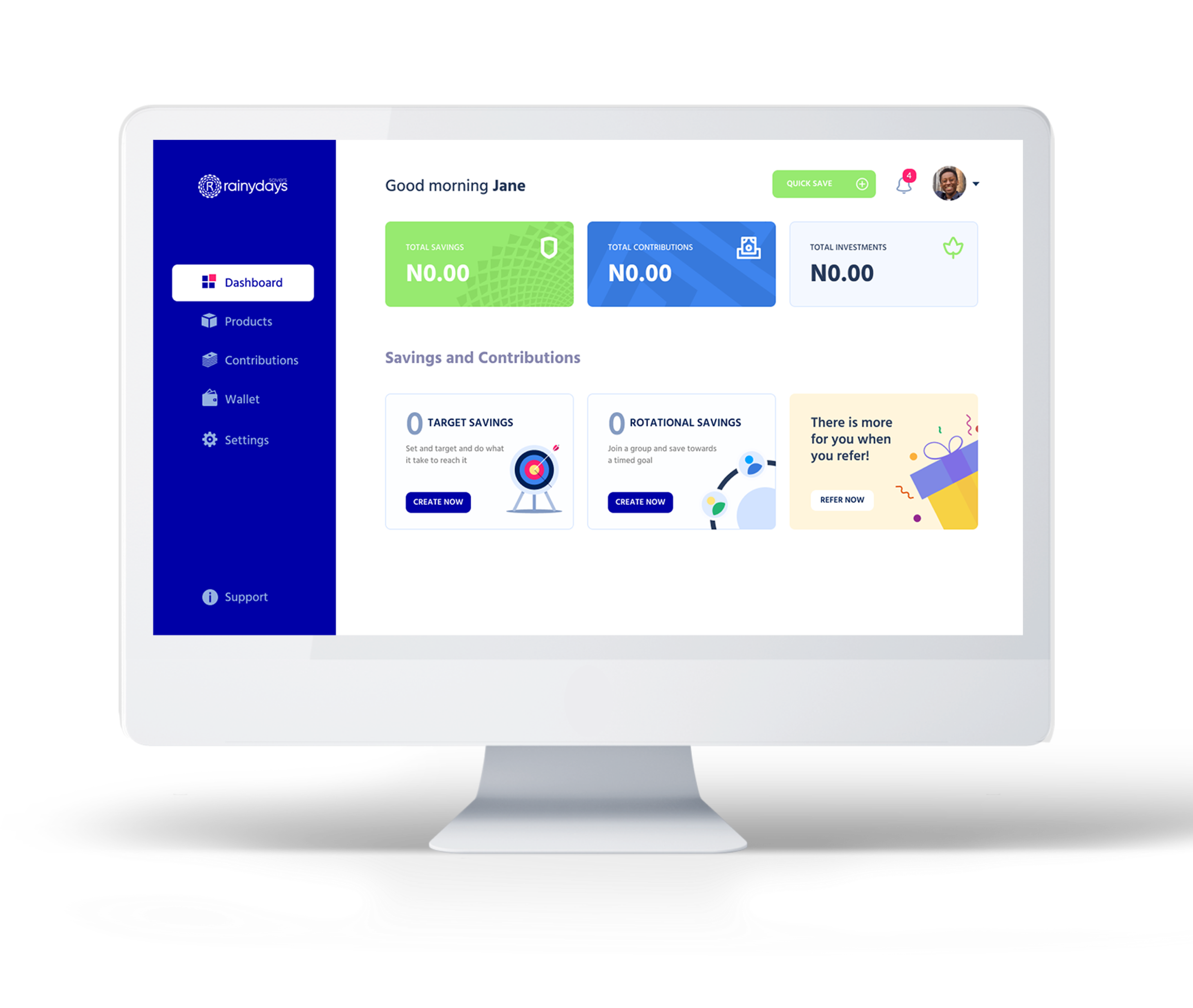
A digital savings platform built for clarity and trust.

Rainydays Saver is a digital savings and credit platform for people who want flexible, transparent ways to grow and access money. Users can join rotational savings circles, set up solo target plans, invest, or request short-term loans — all within a single, trusted experience.
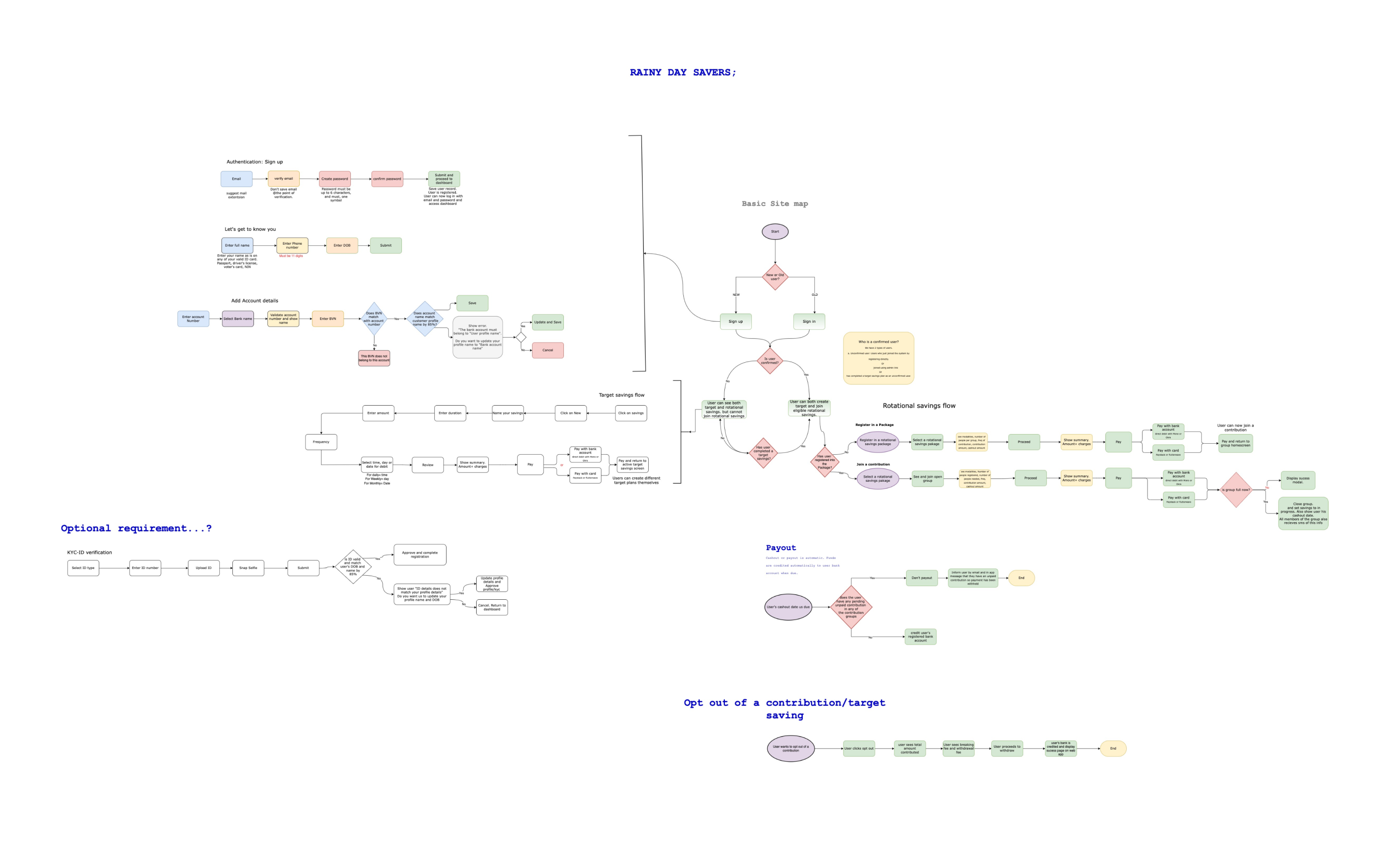
Operations relied on spreadsheets and WhatsApp chats, which slowed onboarding, approvals, and trust-building. The team wanted to digitize every product (Target Savings, Rotational Savings, Investments, and Loans) without losing the human reassurance early adopters expected. They partnered with a product manager to shape initial flows, then brought me in to turn those flows into a cohesive end-to-end experience for both customers and admins.
Design both the admin and consumer interfaces, create a consistent visual system, and simplify critical journeys so people could confidently save, invest, and request credit.
Starting from the client’s initial flow, I refined entry points, simplified decision branches, and tightened the language so users always knew what happens next. Admin screens were organized around speed-to-decision, while user journeys prioritized reassurance (progress markers, upfront eligibility signals, and transparent fees).
Admin Dashboard
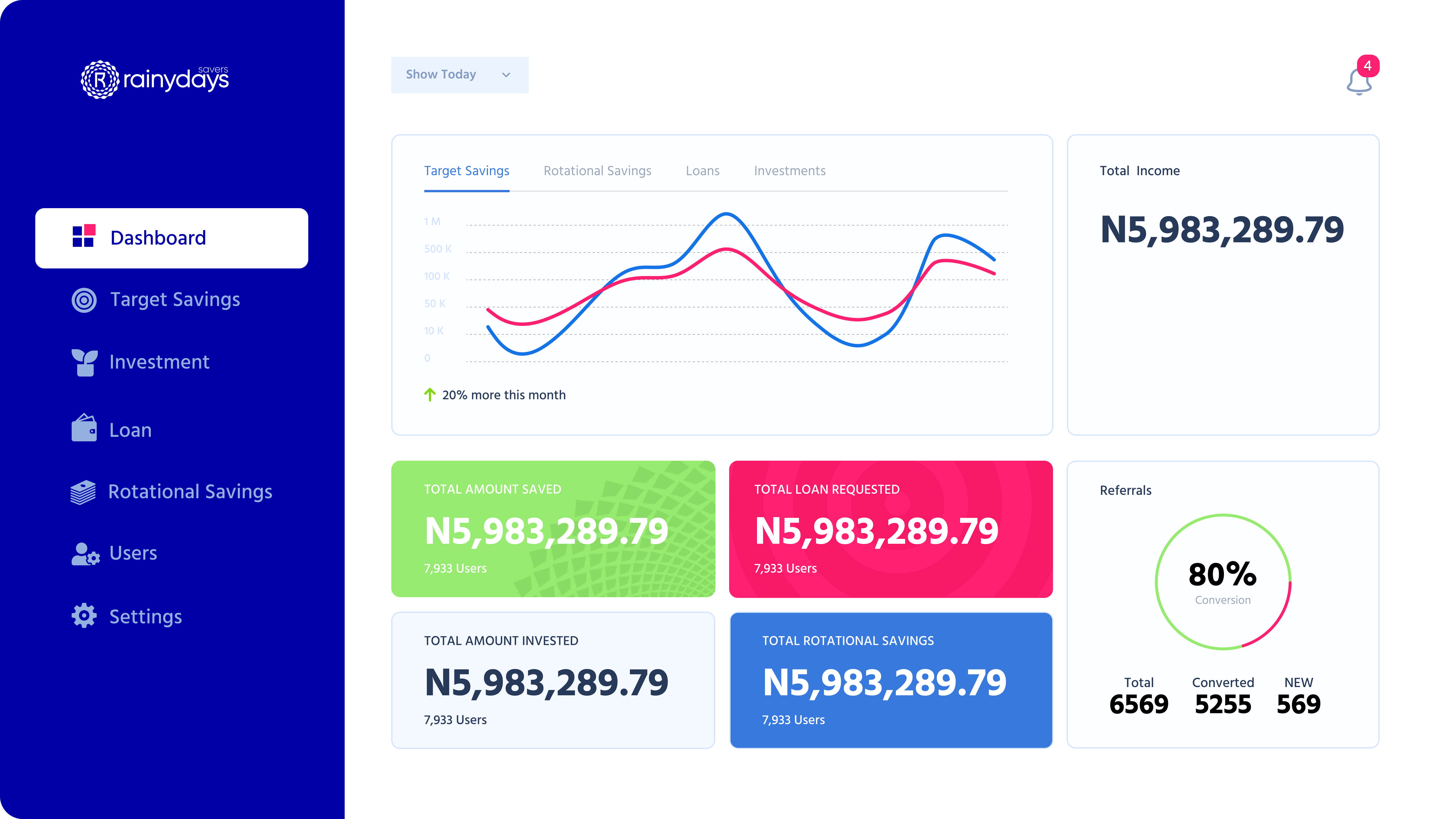
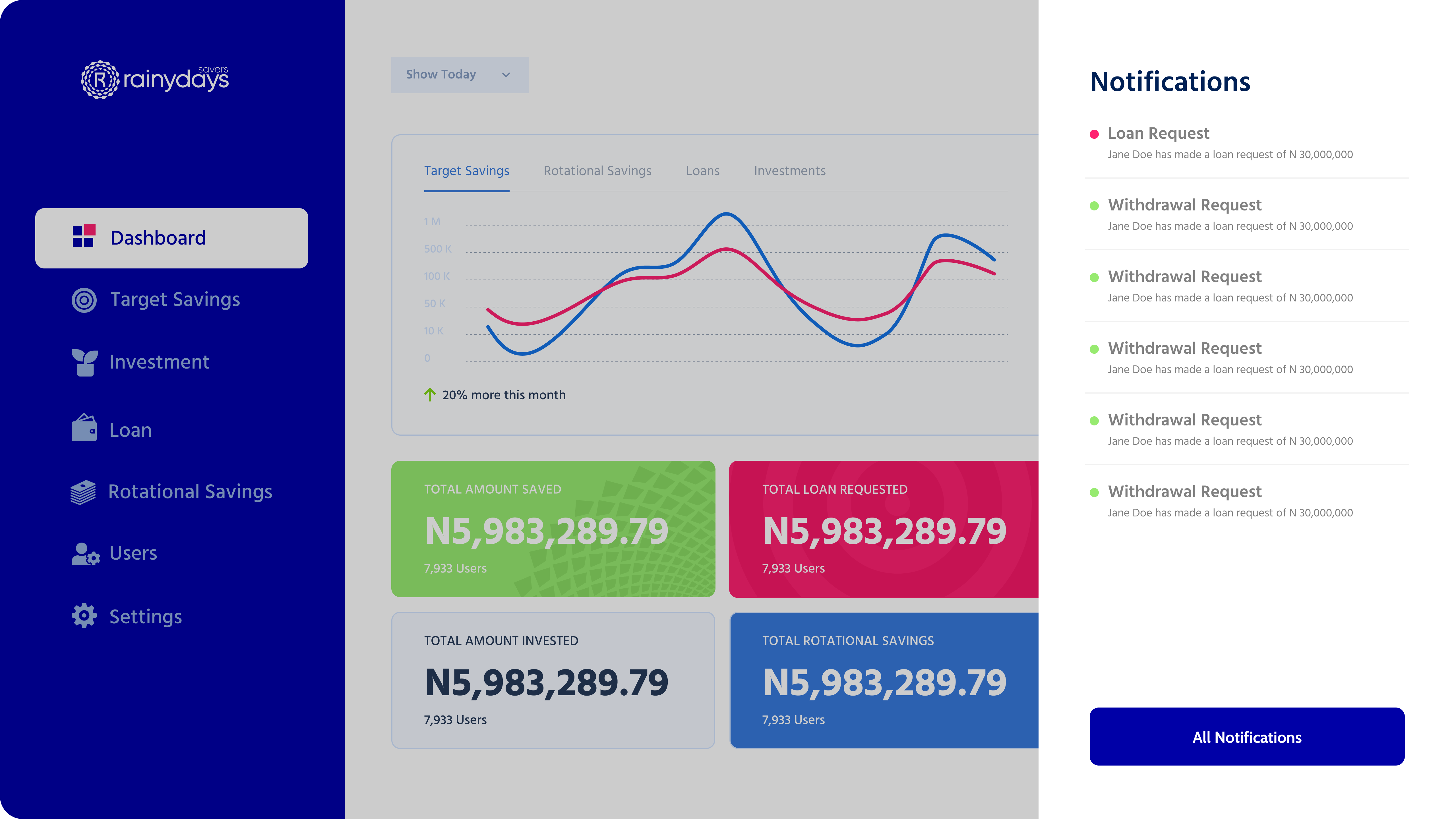
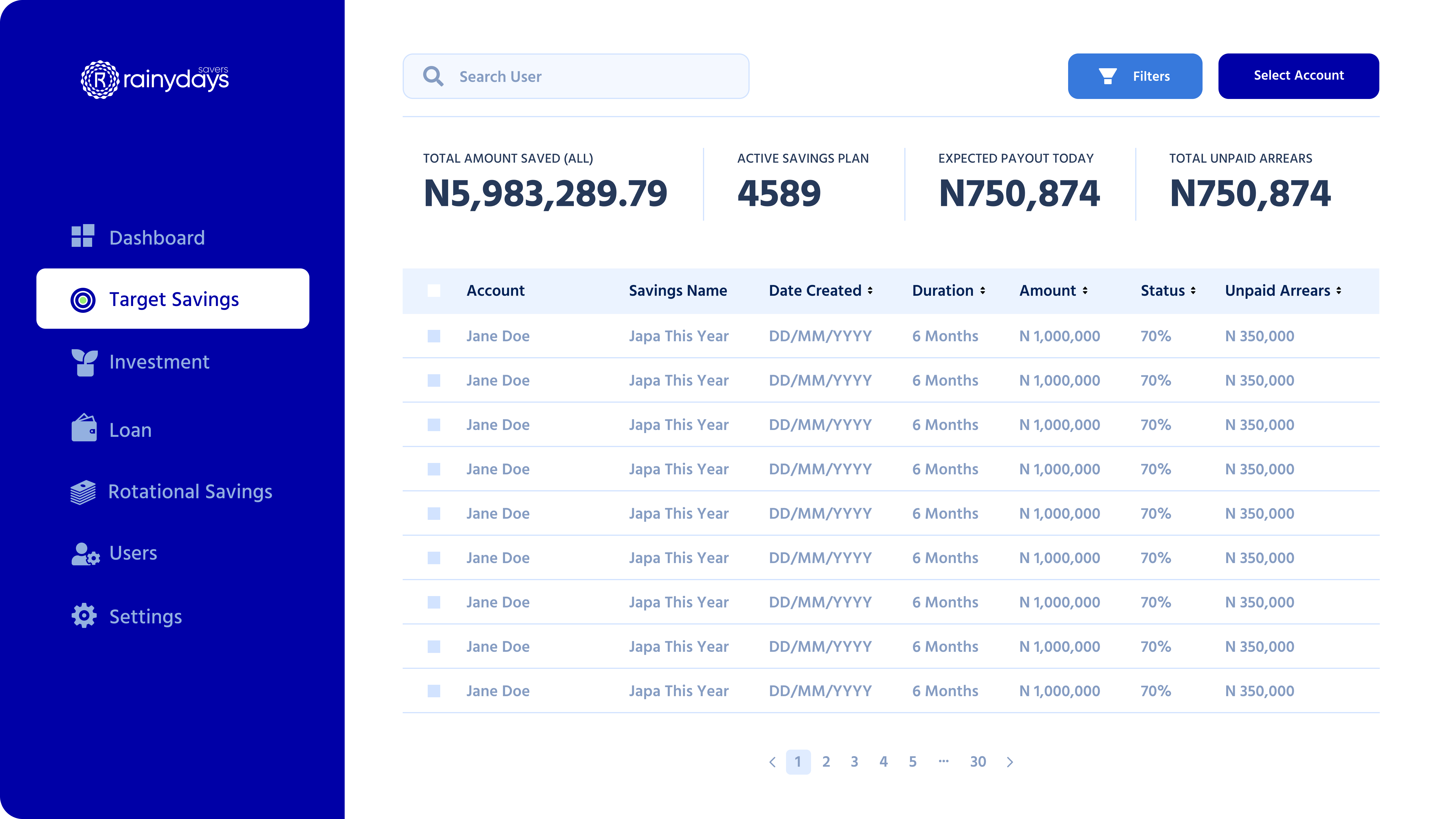
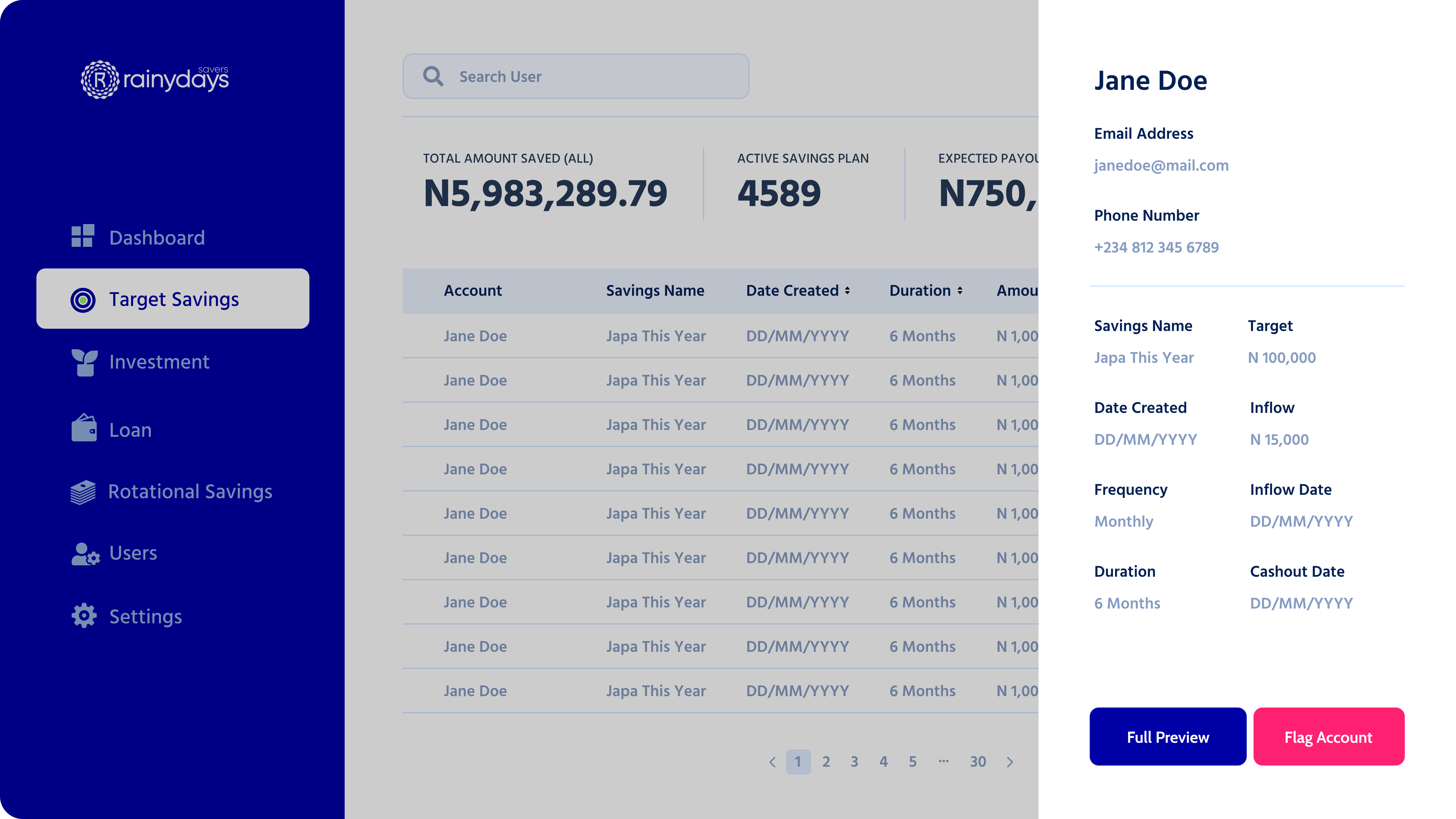
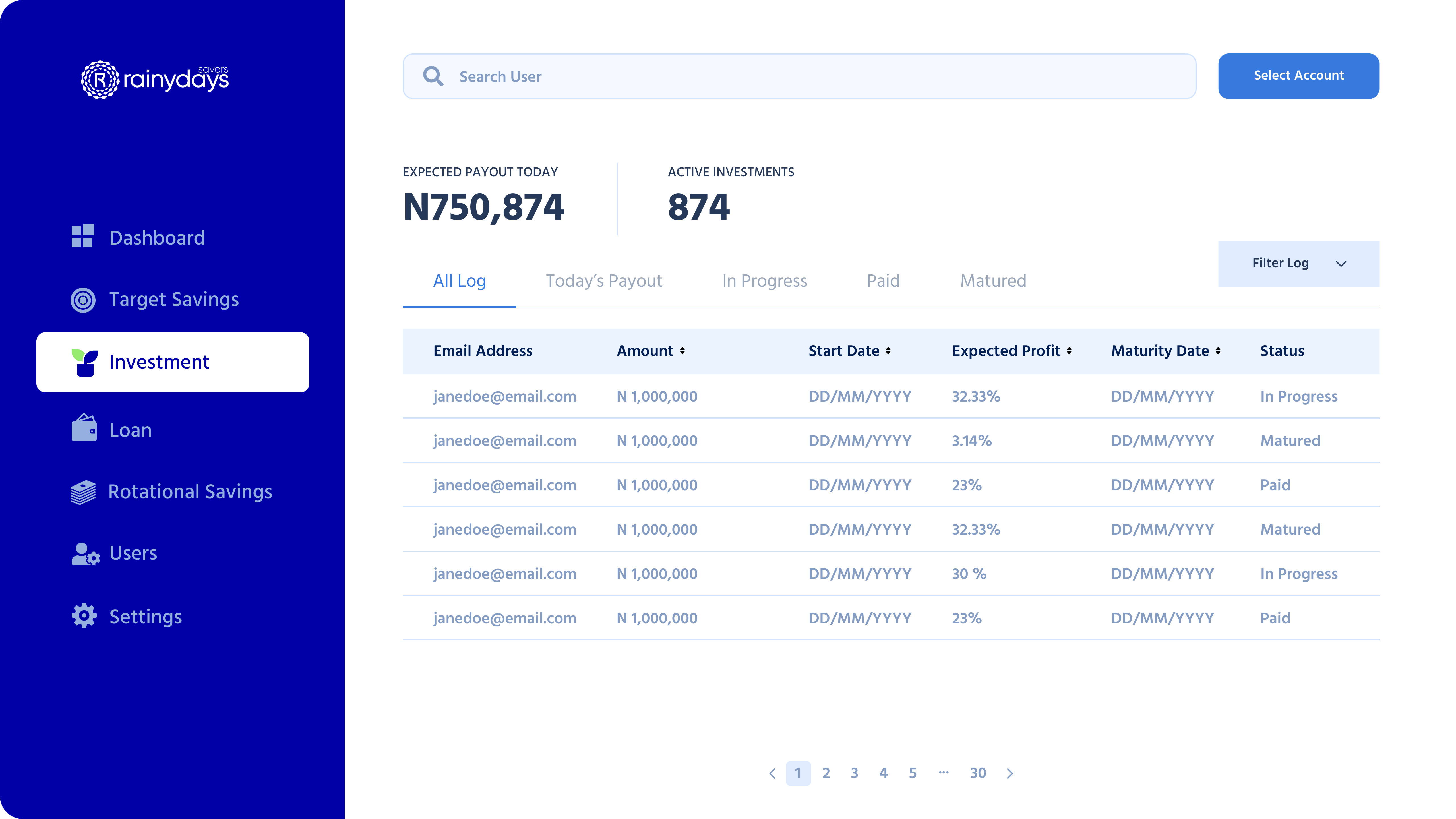
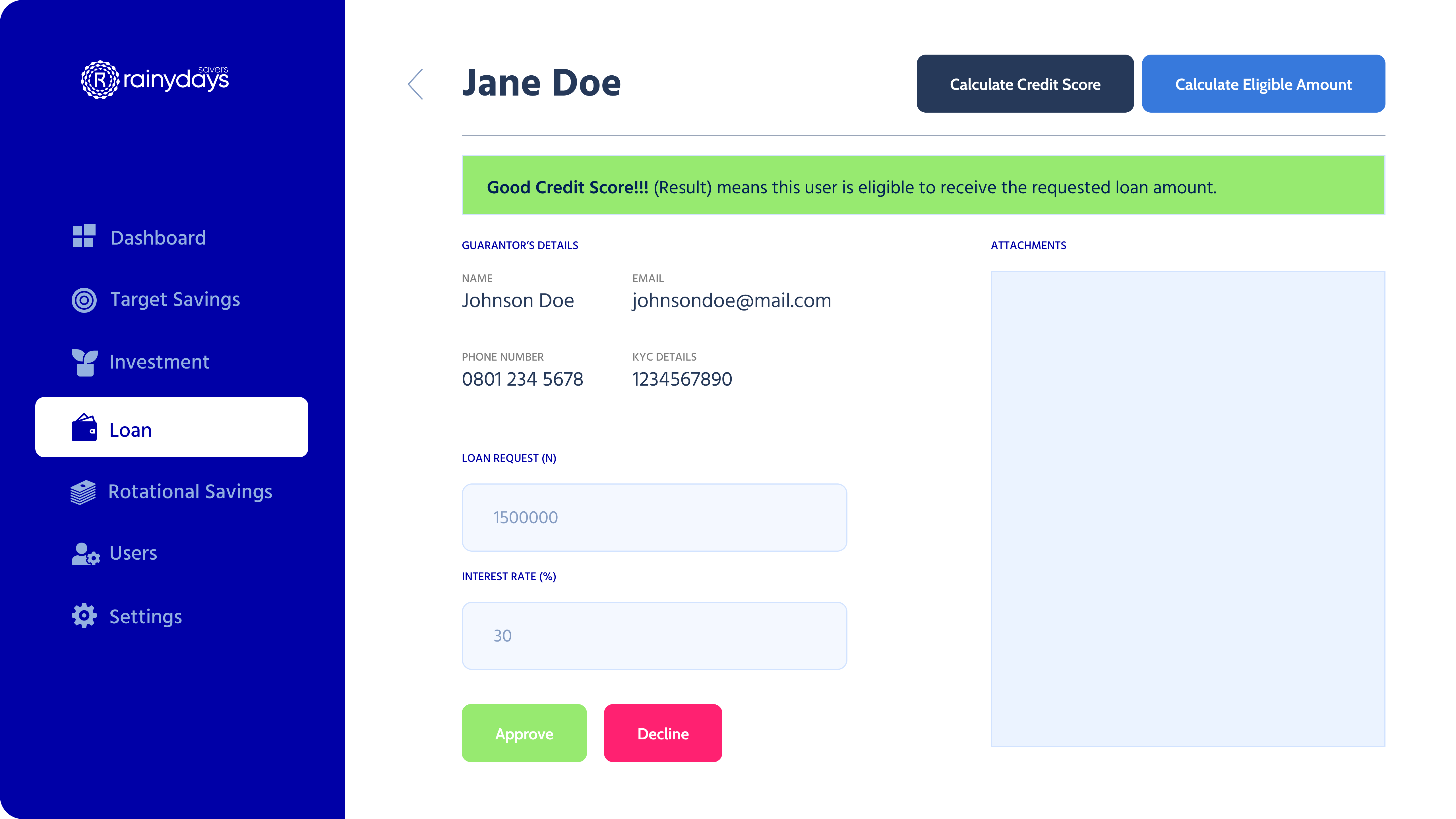
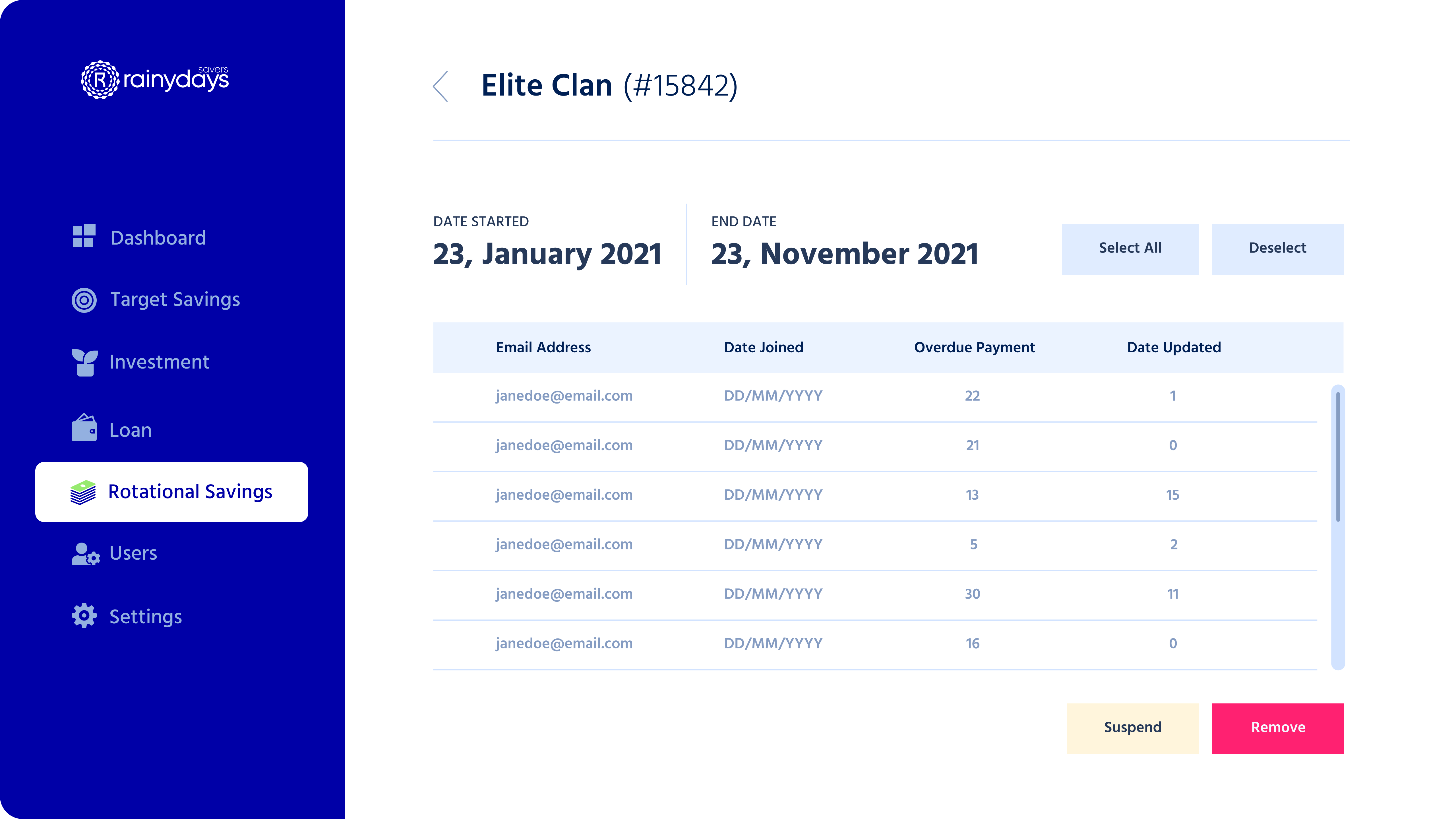
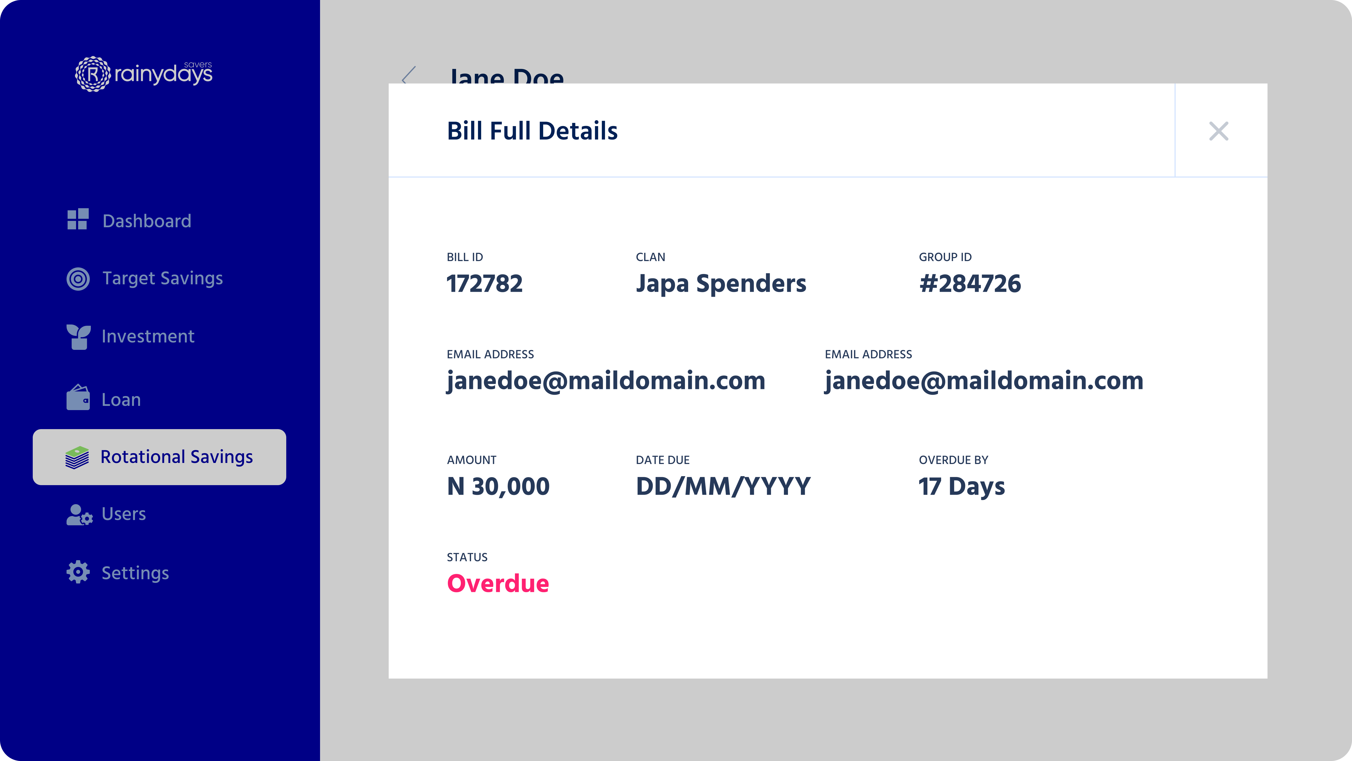

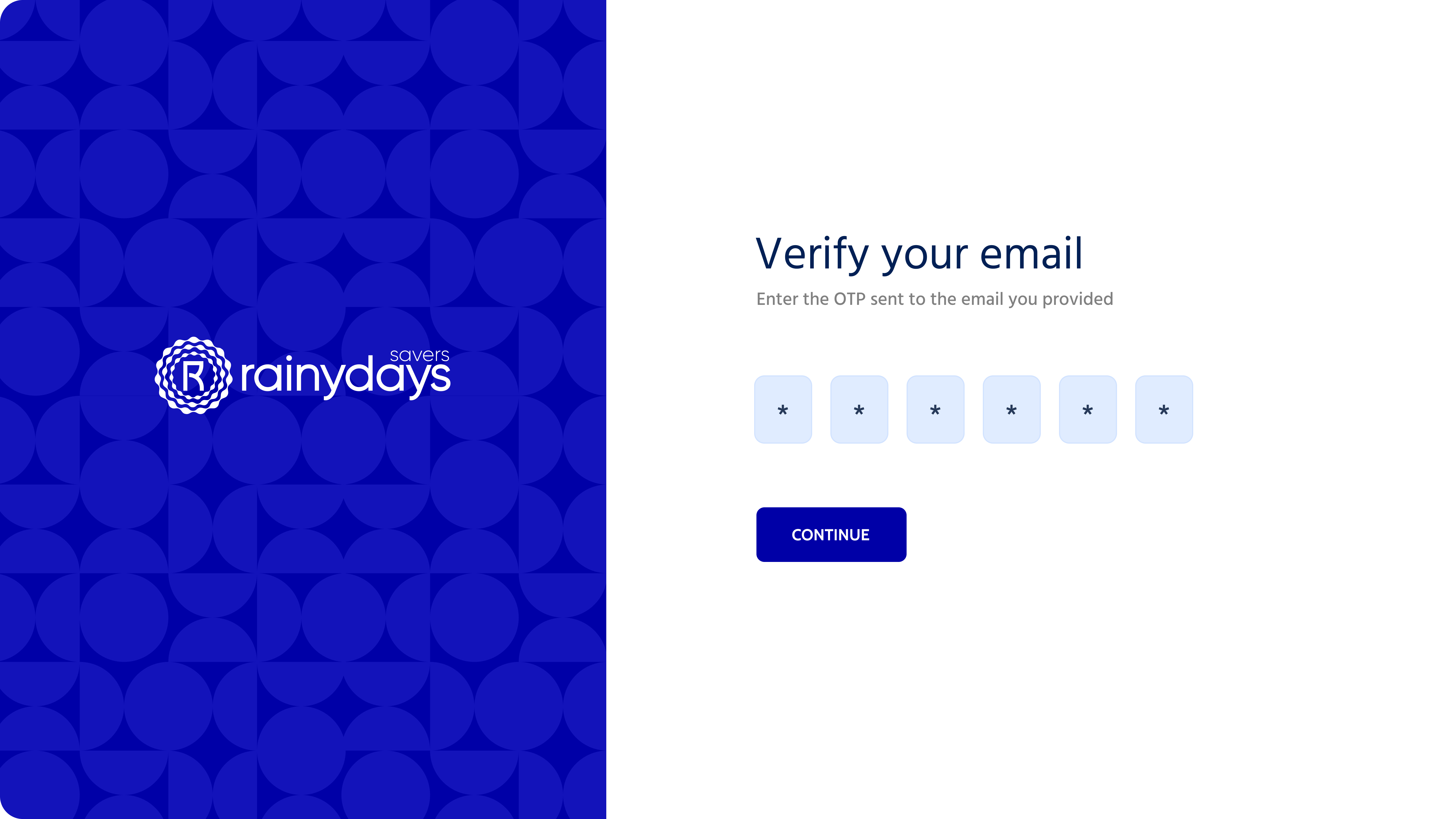
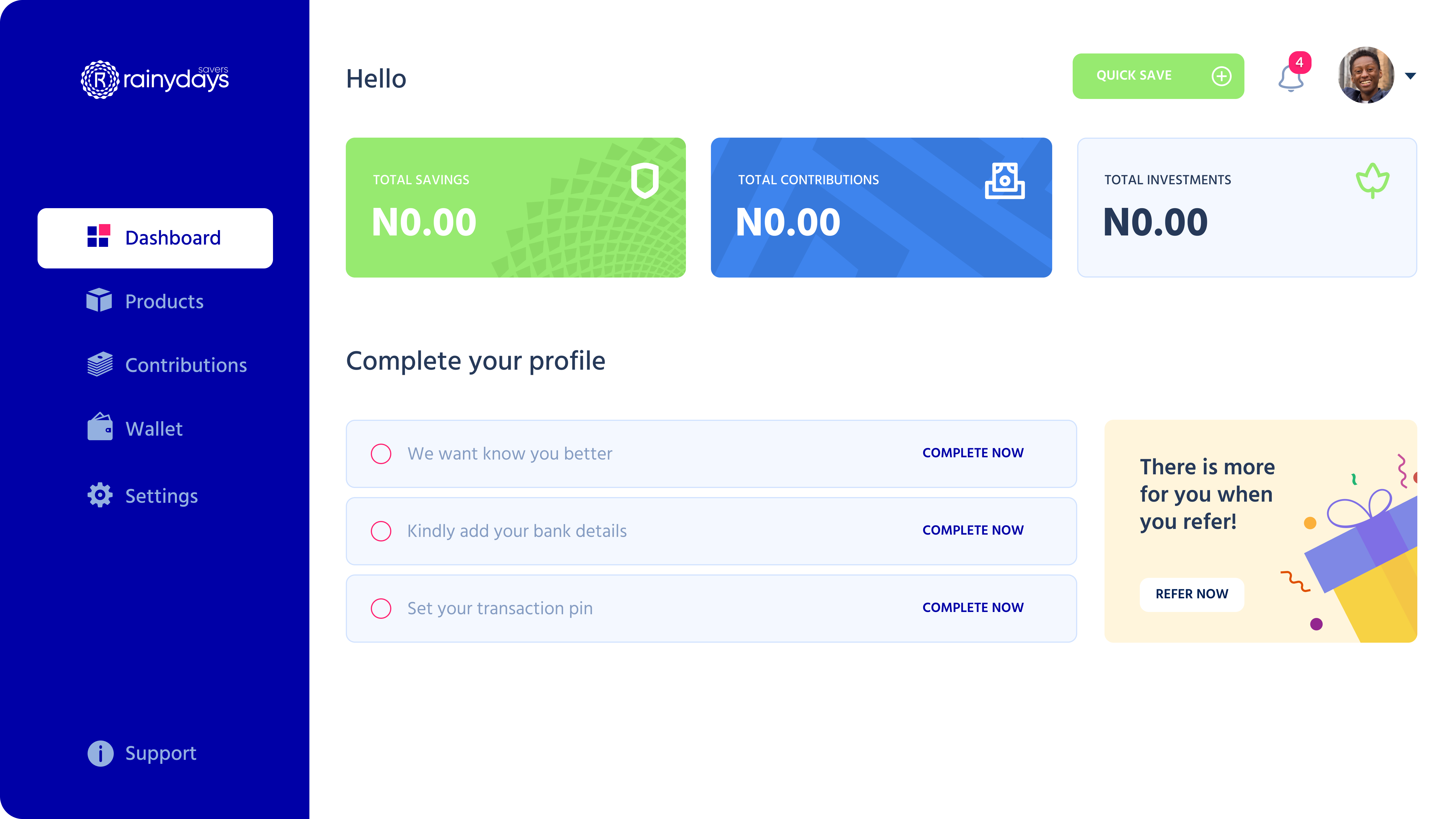
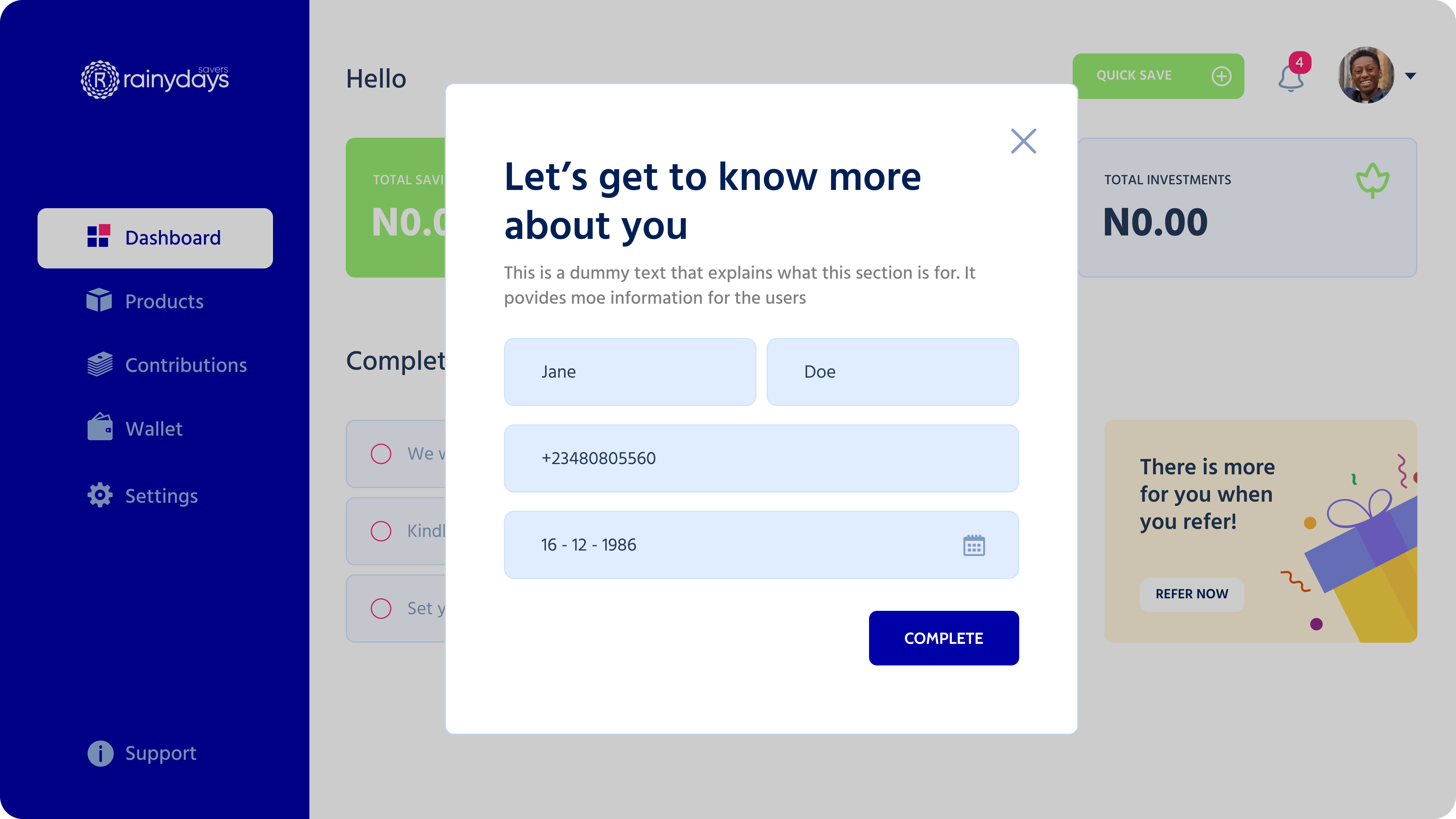
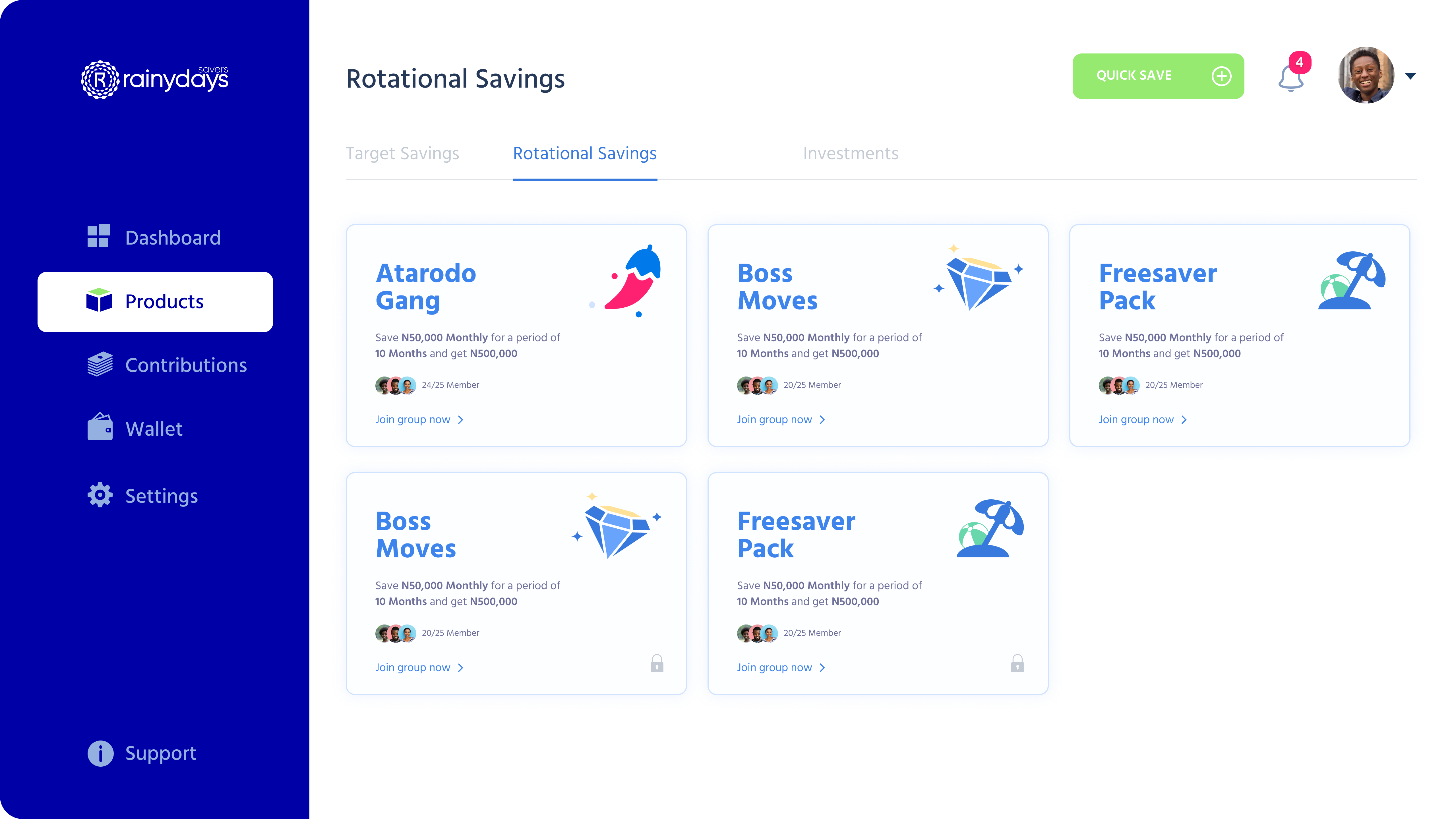
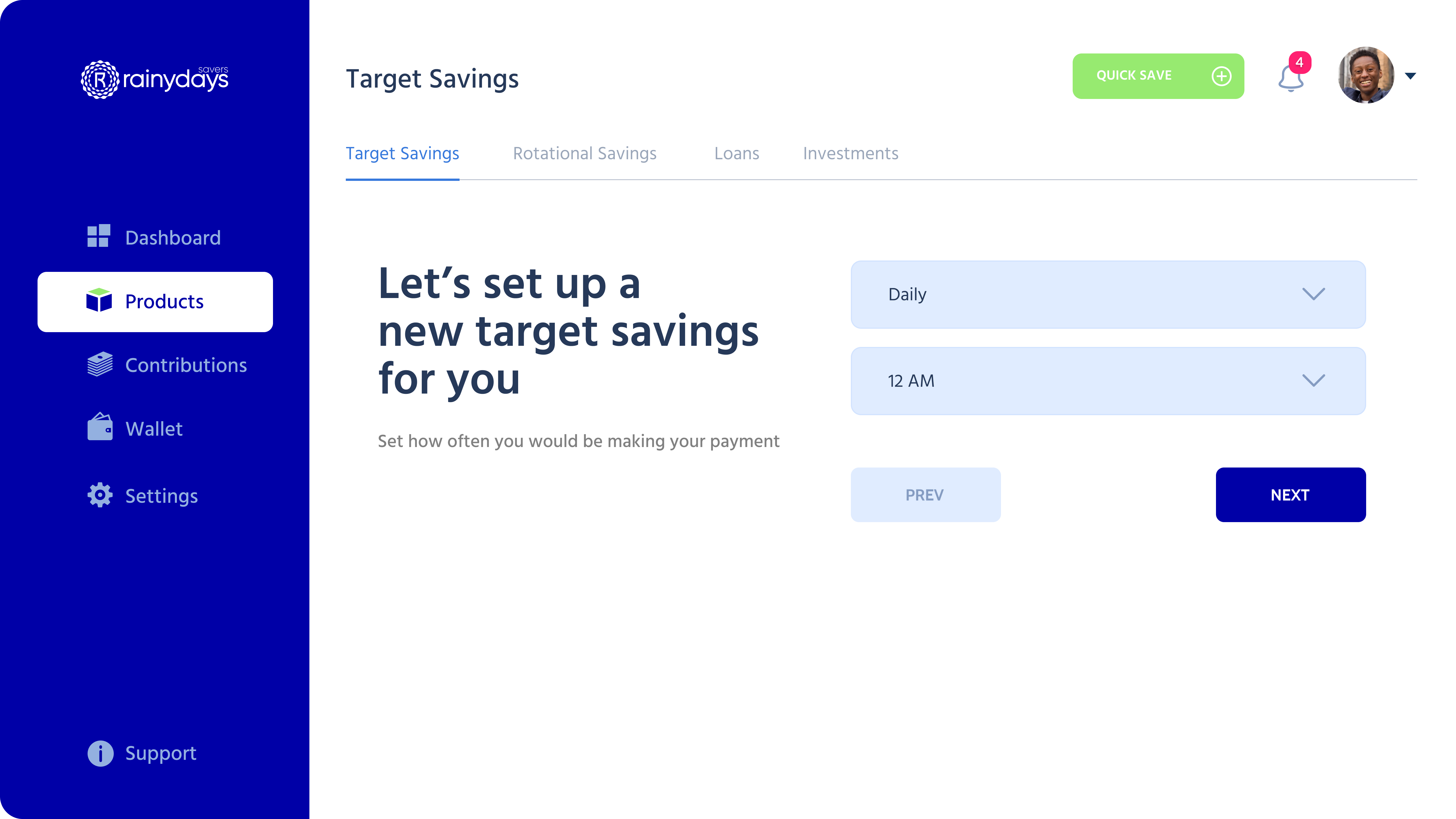
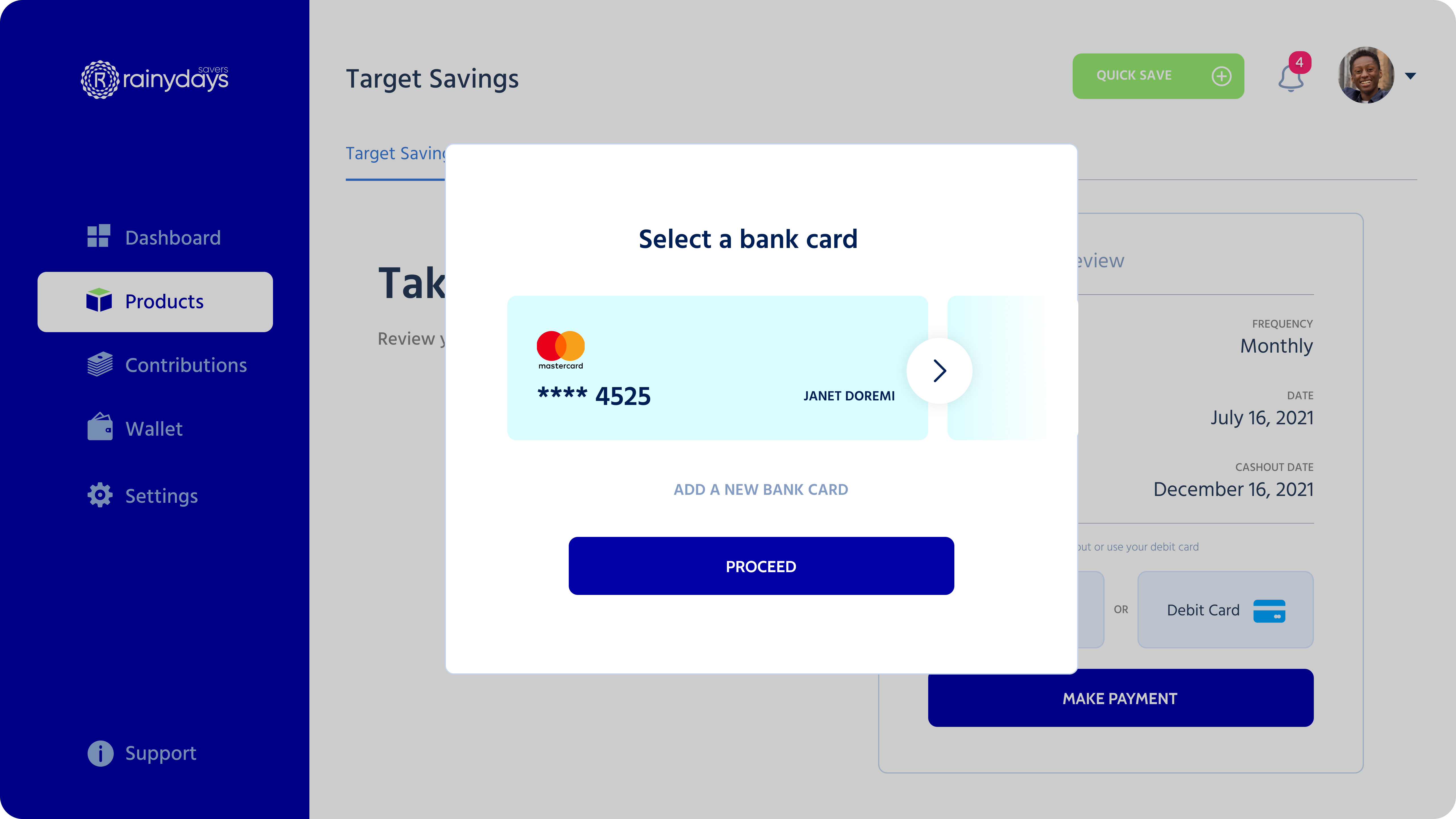
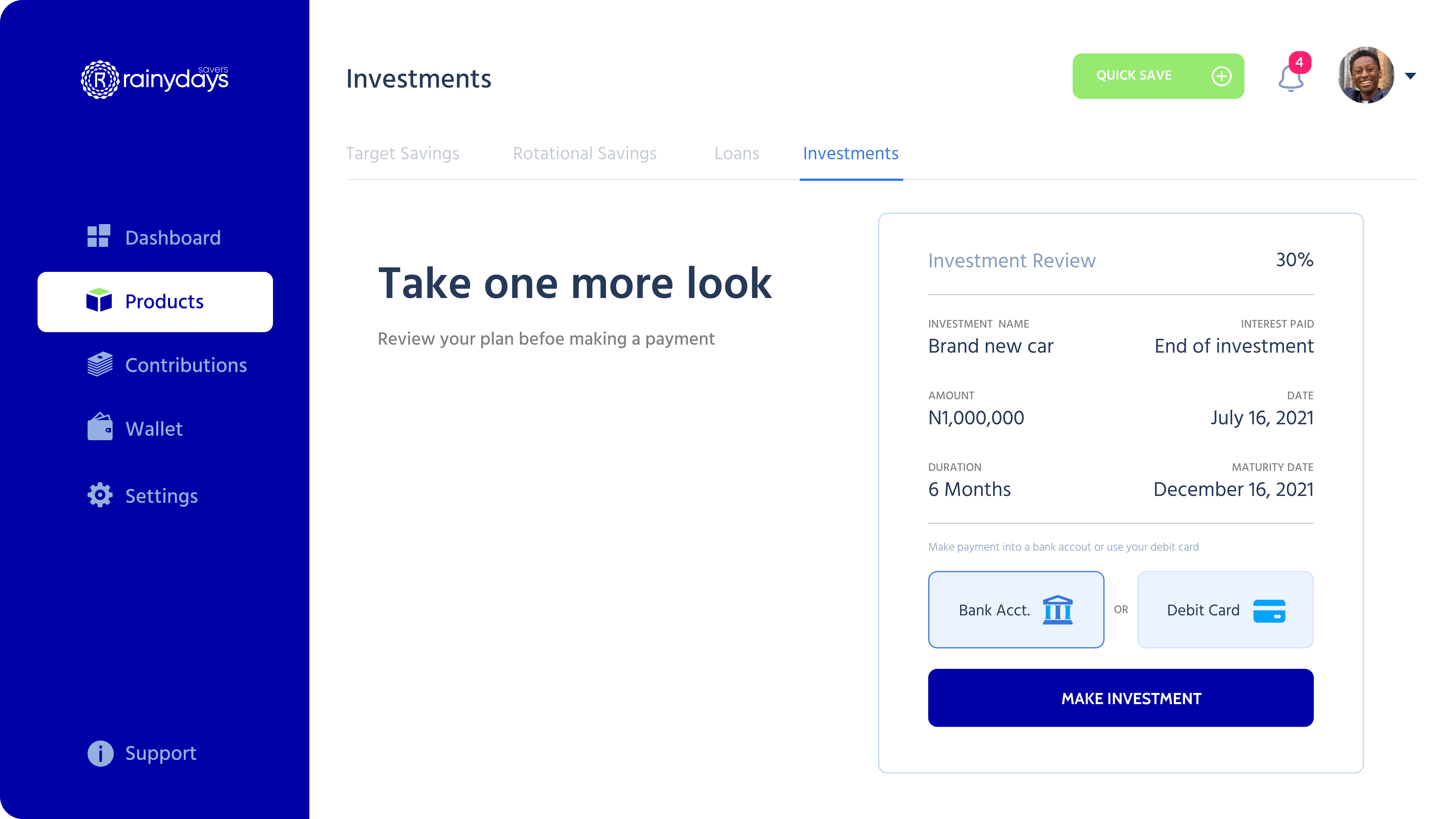
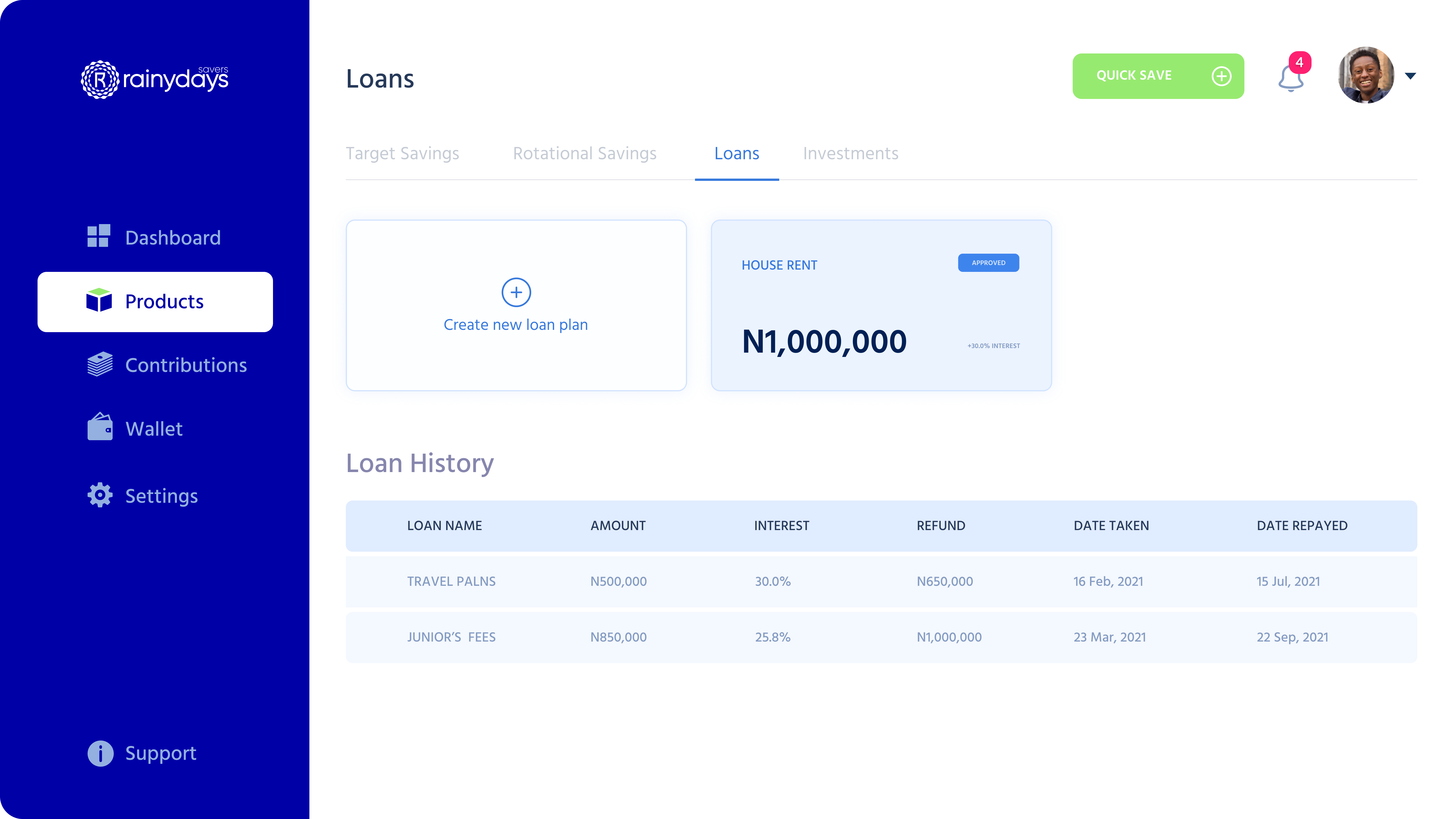

The redesign delivered a coherent experience across admin and user journeys. By tightening the flows and surfacing trust signals, we reduced decision friction for admins and made savings and credit feel approachable for customers. Collaborative reviews with the client kept alignment high and sped up approvals.
Tell me what you’re imagining and I’ll reply with how we can make it real