CasaFlo
Unified booking for short-lets and rentals · Lagos
Product Designer · CasaFlo · 2020 · 4 months
How do you turn word-of-mouth trust and manual bookings into a self-serve platform that still feels personal and premium?
The Challenge
The Lagos short-let market is crowded and fast-moving. CasaFlo had real trust—built on calls, DMs, and word of mouth—but growth exposed the cracks. Agents hunted availability. Customers waited on callbacks. Payment confirmations dragged. Meanwhile the offer was expanding beyond short-lets into hotels, beach houses, cars, party houses, and essentials.
Approach
Design one web and mobile product where listings, booking, and payments feel instant and trustworthy—while giving the extended catalog a single confident system.
- End-to-end web booking: search → compare → book → pay → confirm
- Mobile parity with tighter summaries and faster filters
- Multi-category marketplace under one visual system
- Wallet-forward checkout for repeat guests
Key Design Decisions
Decision 1
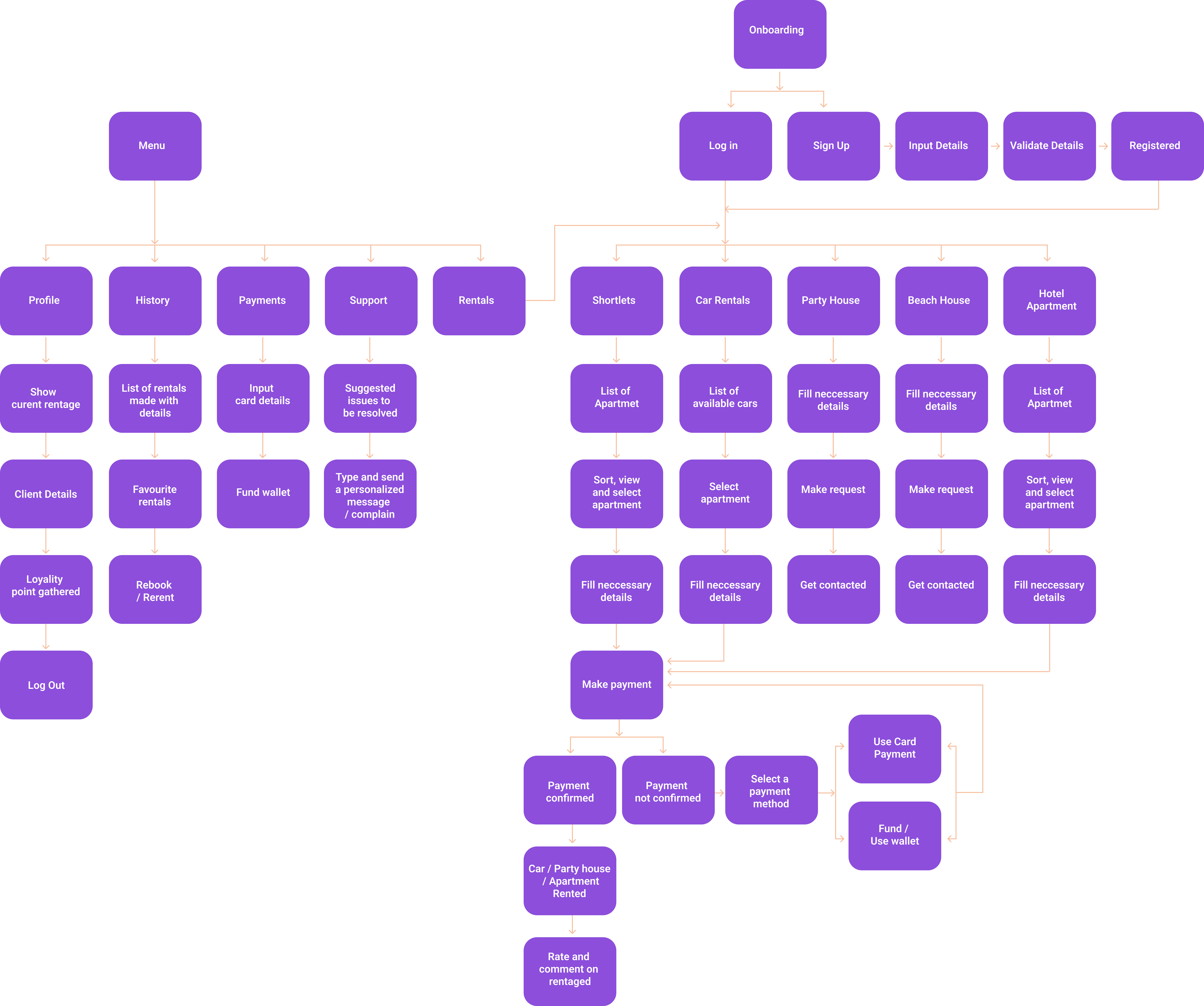
Multi-category marketplace IA
The Decision: Treat CasaFlo as a unified marketplace—short-lets, hotels, beach houses, cars, party houses, essentials—not a short-let app with bolted-on extras.
Why: The business already sold across categories through people. The product had to make that catalog browsable without forcing a new mental model per rental type.
Result: Category entry points and consistent listing patterns so guests can switch intents without relearning the app.
Decision 2
Wallet-forward checkout
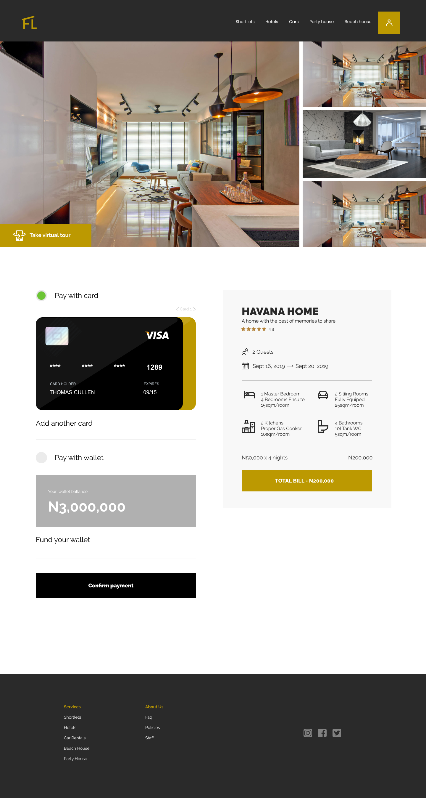
The Decision: Put wallet and card side by side, with wallet positioned for speed on repeat bookings.
Why: First-time guests need card trust. Returning guests need one-tap pay—especially on mobile, where callbacks were killing conversion.
Tradeoff: Extra payment surface to design and explain; faster path for loyal bookers once funded.
Decision 3
Web depth, mobile speed
The Decision: Keep web and mobile on the same journey, but tune density: richer comparison on desktop, tighter summaries and filters on phone.
Why: Parity without cloning. Lagos guests browse on both—desktop for research, mobile for last-mile booking.
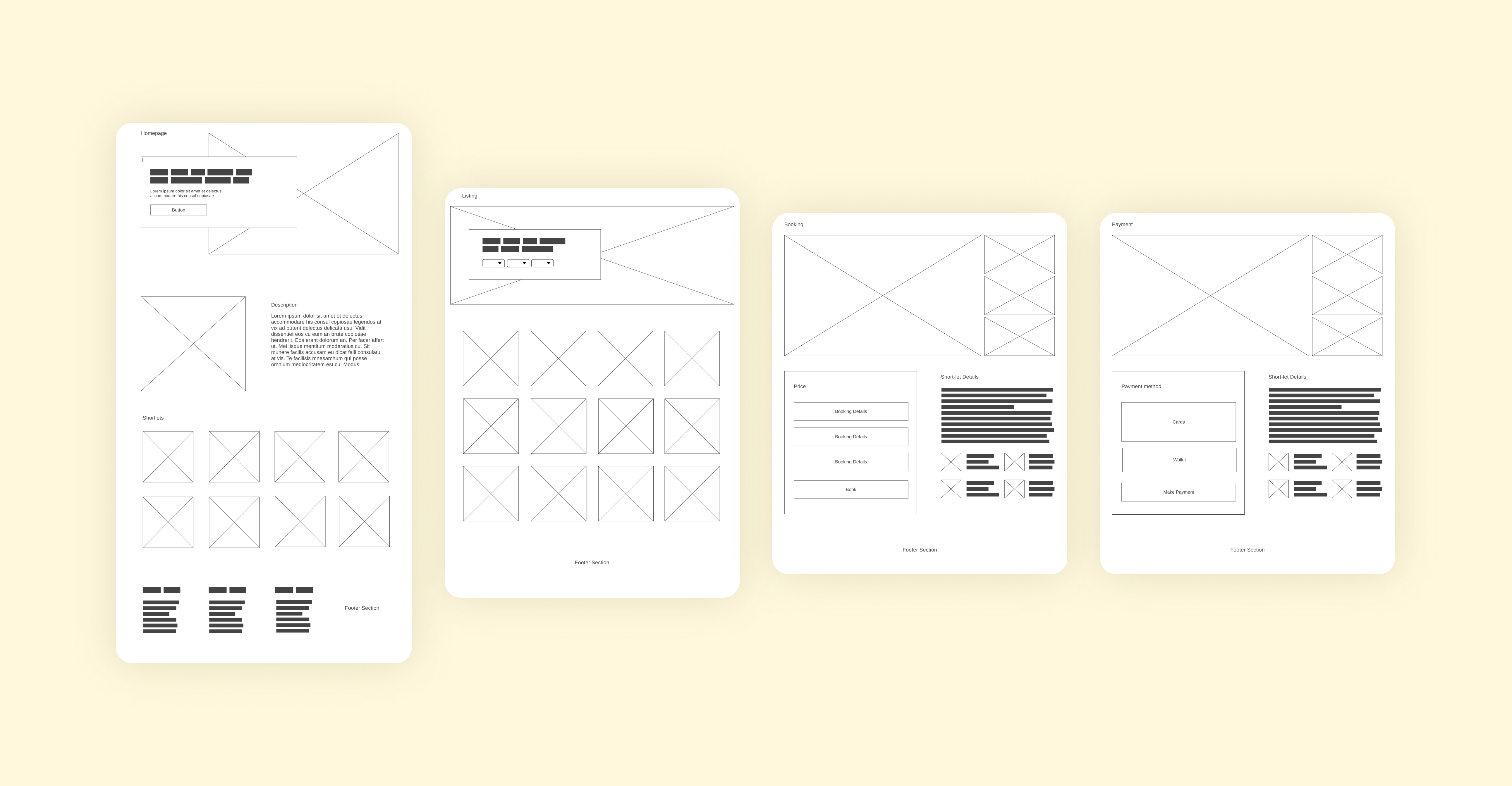
Result: Four core screens validated with the client before high fidelity: landing, listings, booking, payment.
The Experience
Gregory lands in Lagos for a week of work. He opens CasaFlo, filters short-lets in Lekki, compares a few options, and locks check-in details without waiting for a callback.
At checkout he pays from his wallet, gets an instant confirmation, and can see the booking in his history. Same flow Queen would use for a party house—discover, compare, book, pay—just a different category at the start.
Interface Design
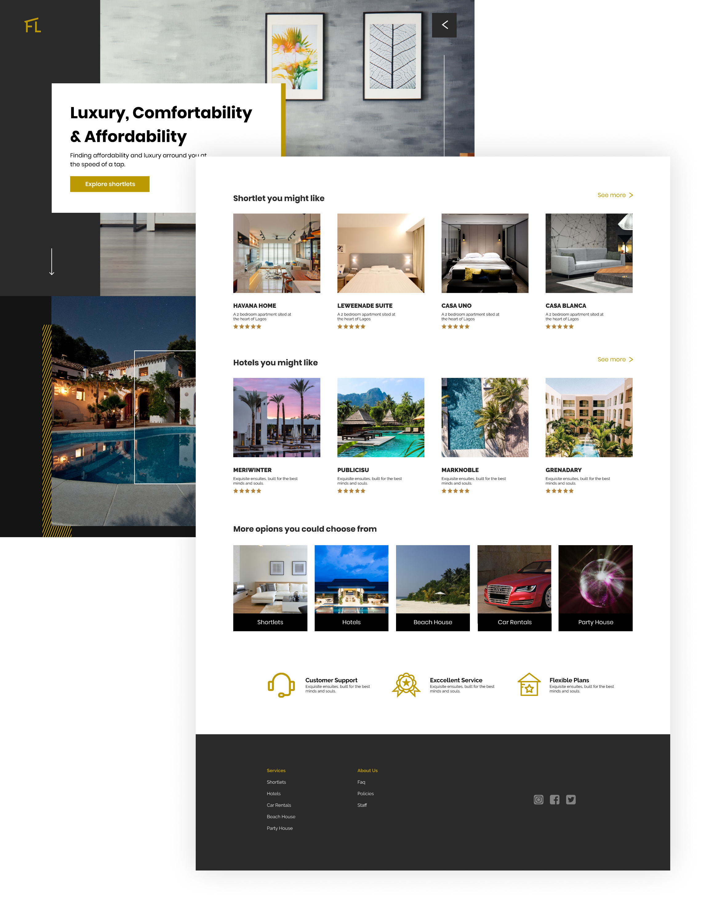
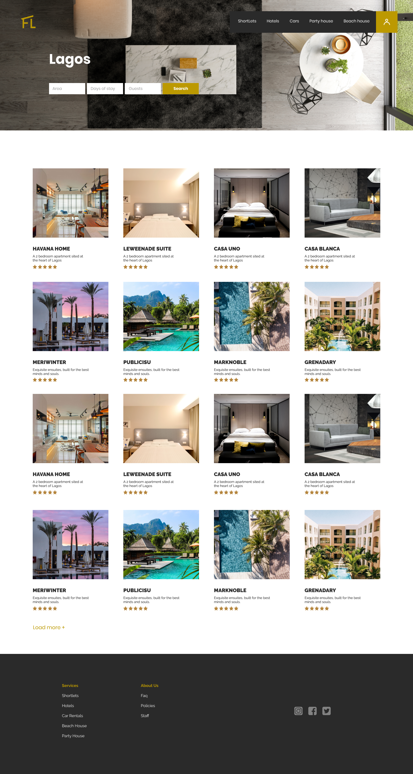
Landing and discovery
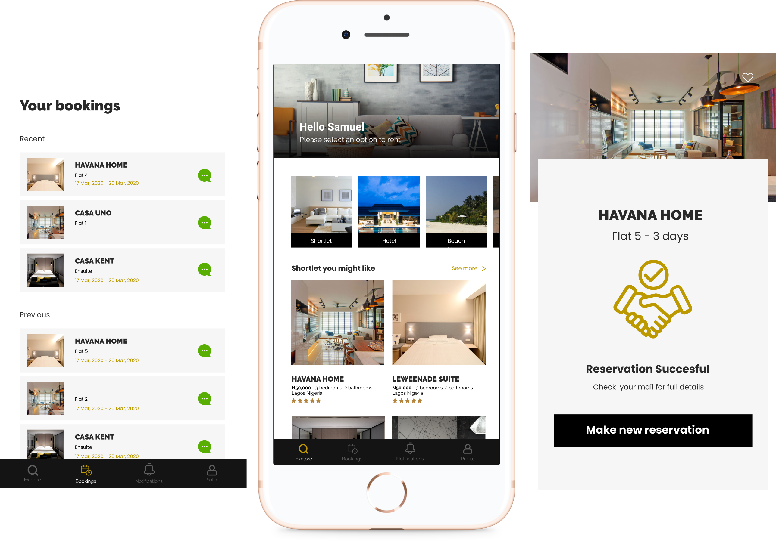
Hero focused on speed and trust, with category entry and listing grids that push visitors into relevant stays fast.
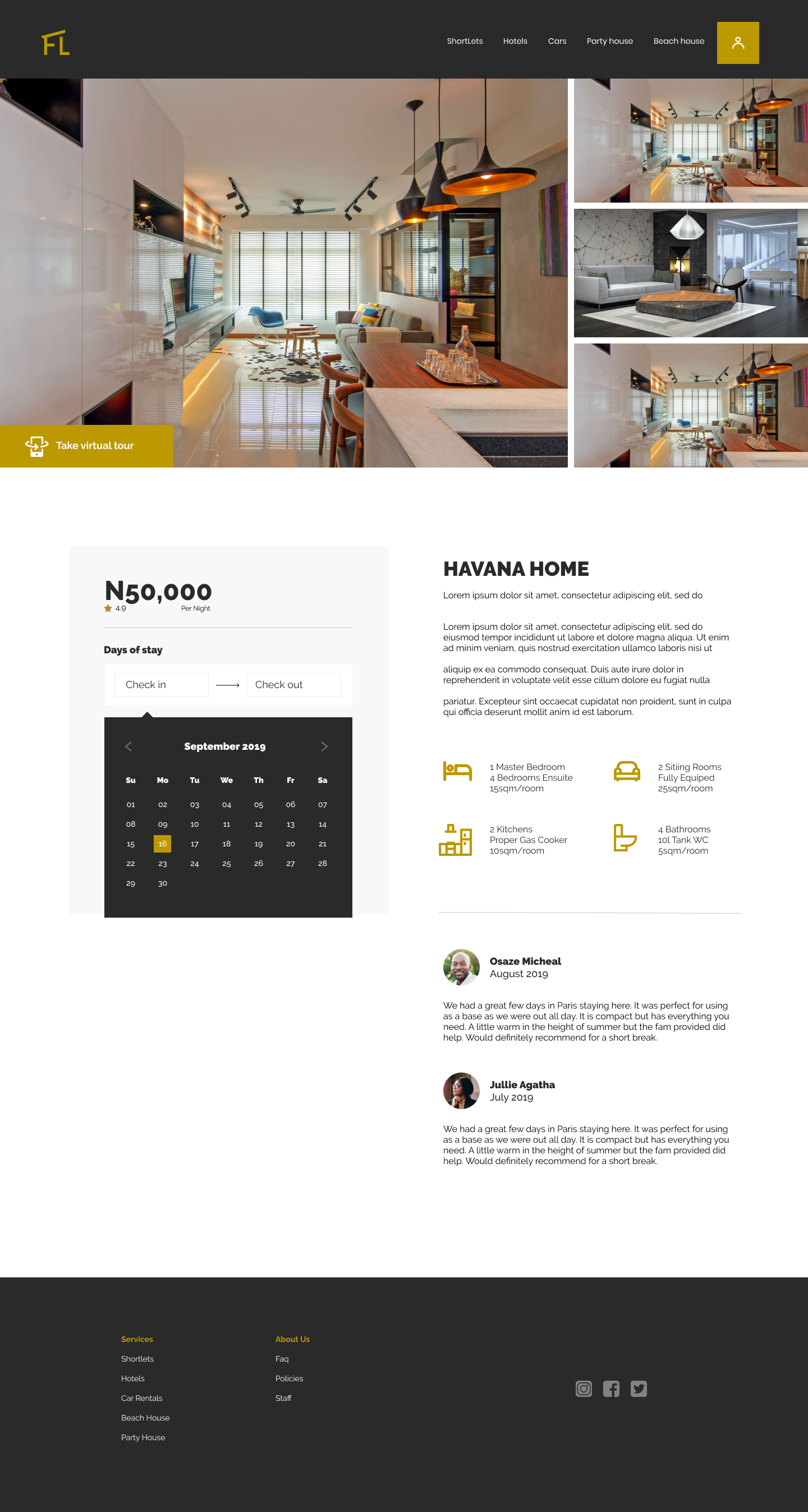
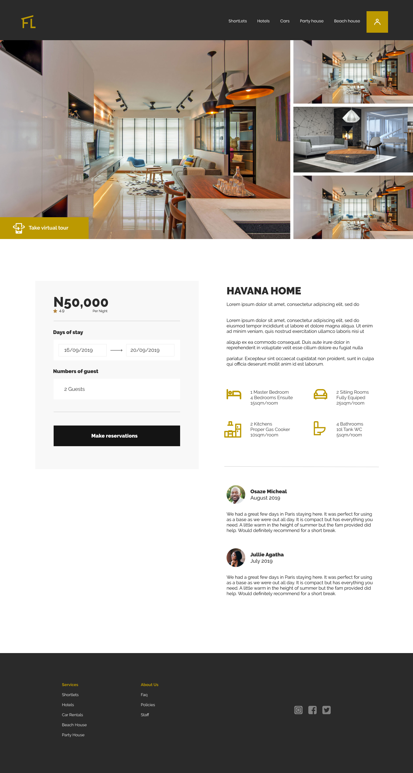
Booking details
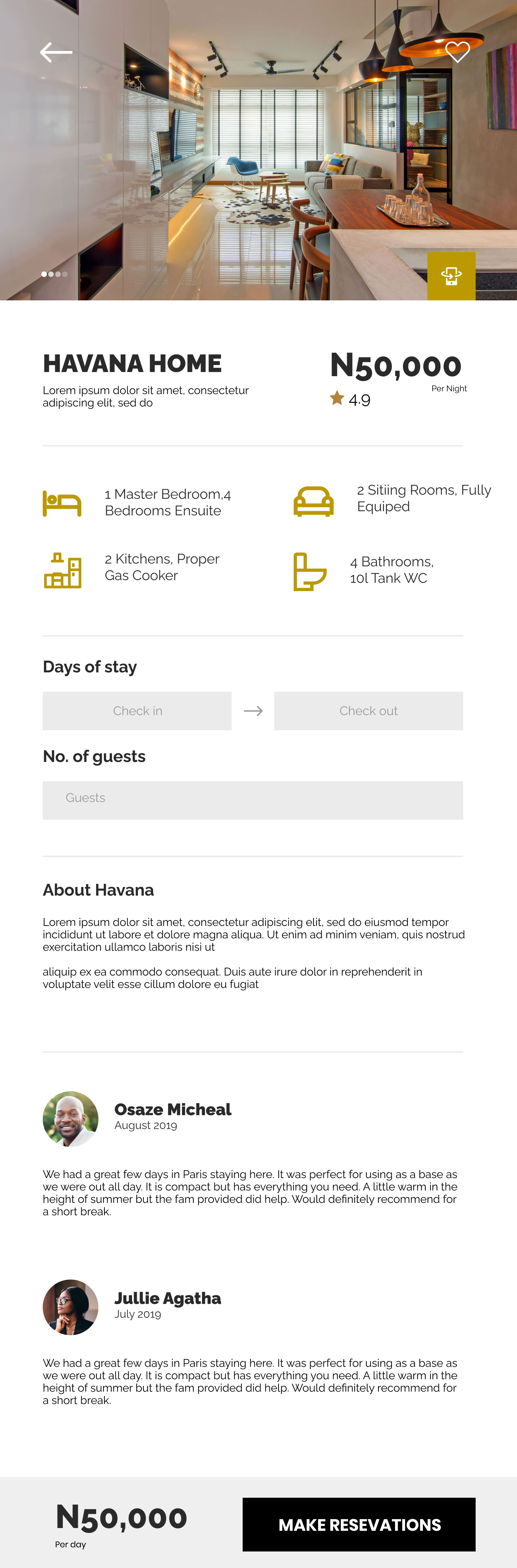
Check-in, guests, and stay details designed so “what happens next” is obvious before payment.
Pay and confirm
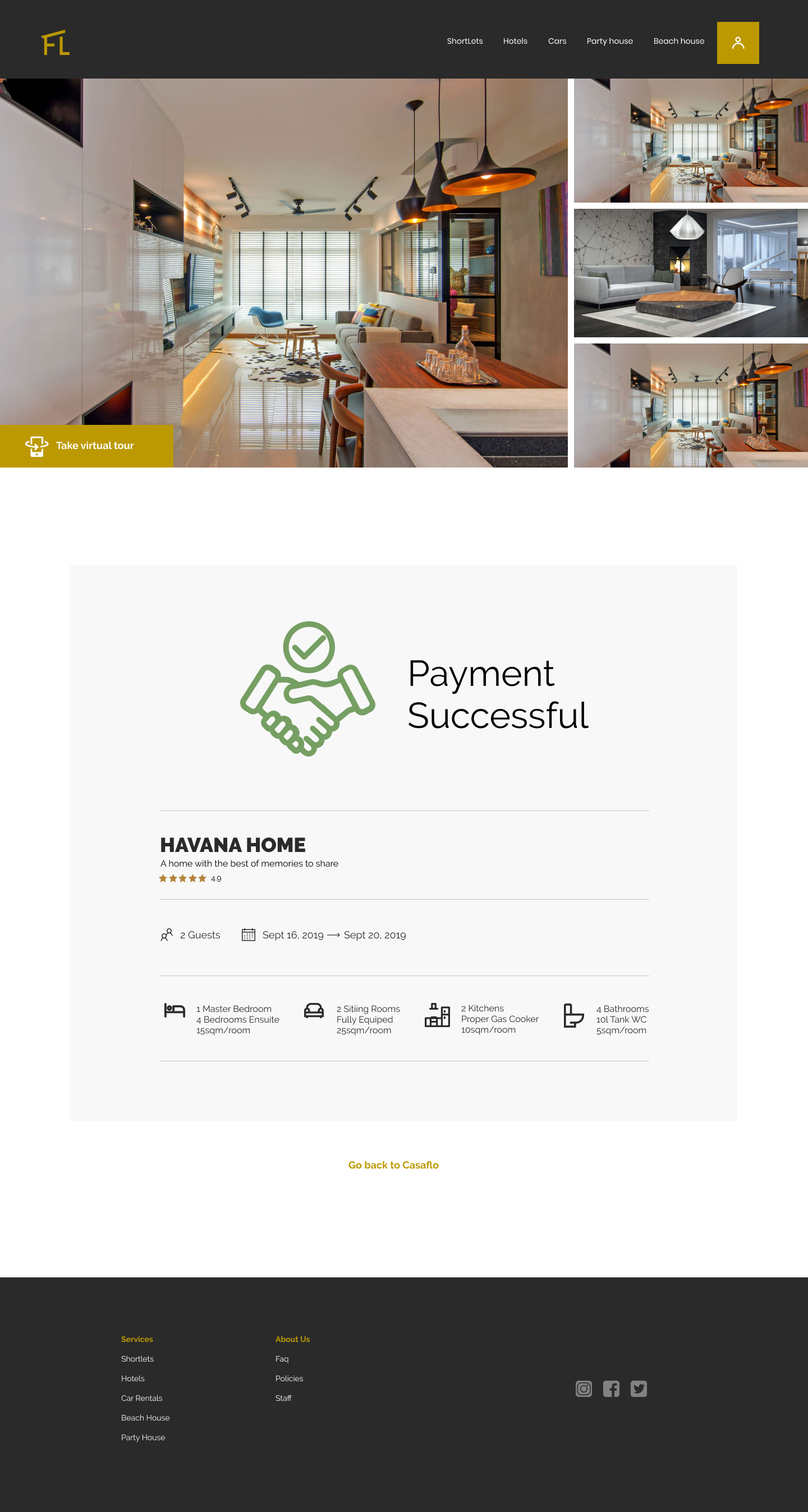
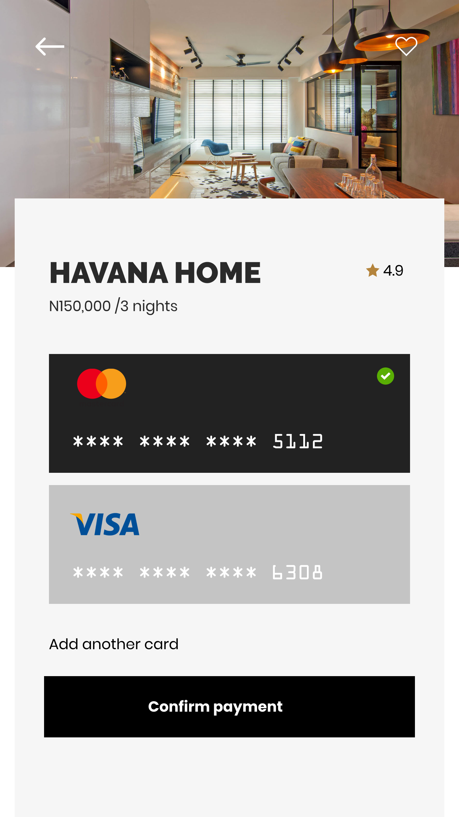
Card and wallet checkout with a clear reservation success state—no waiting on a WhatsApp confirmation.
Mobile parity
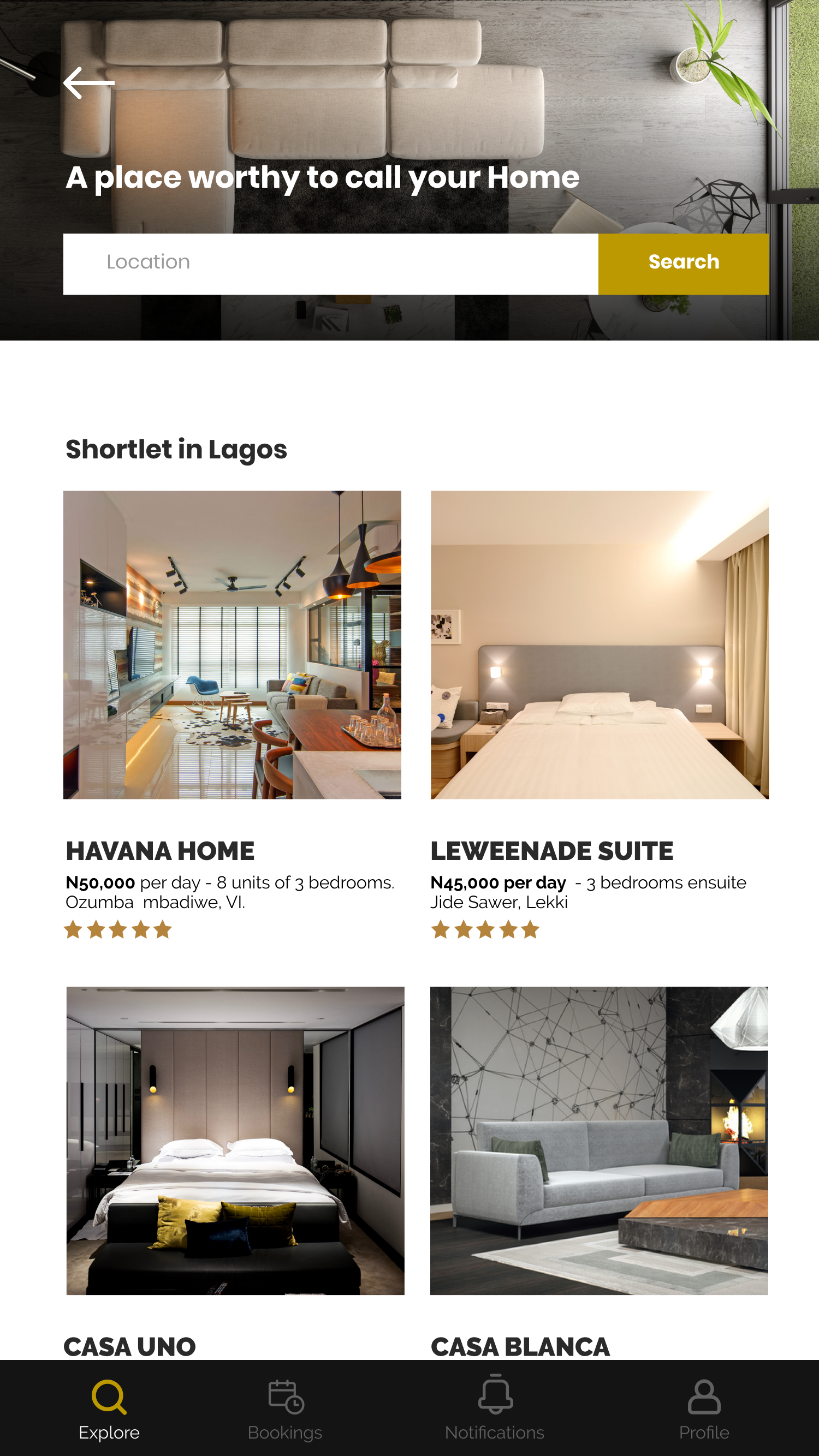
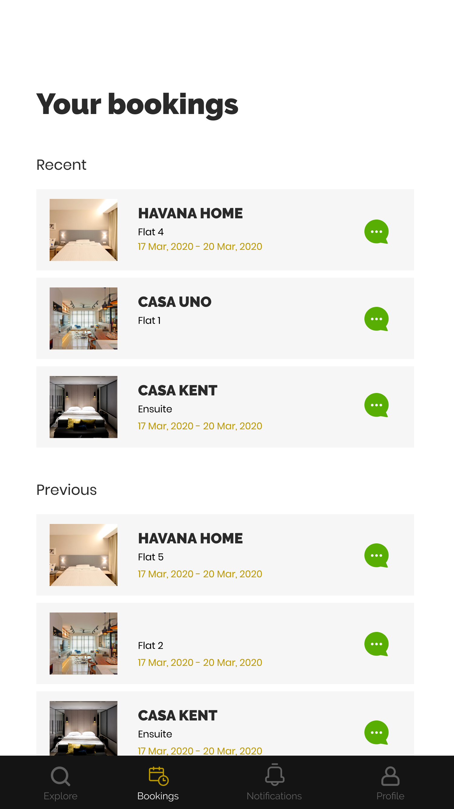
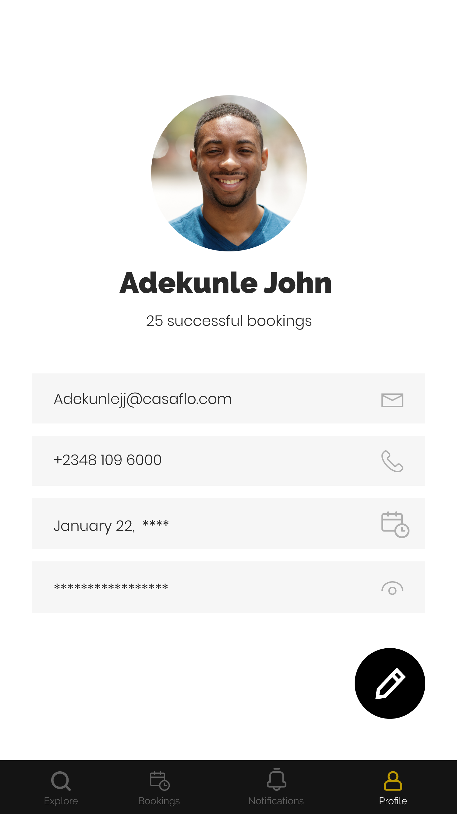
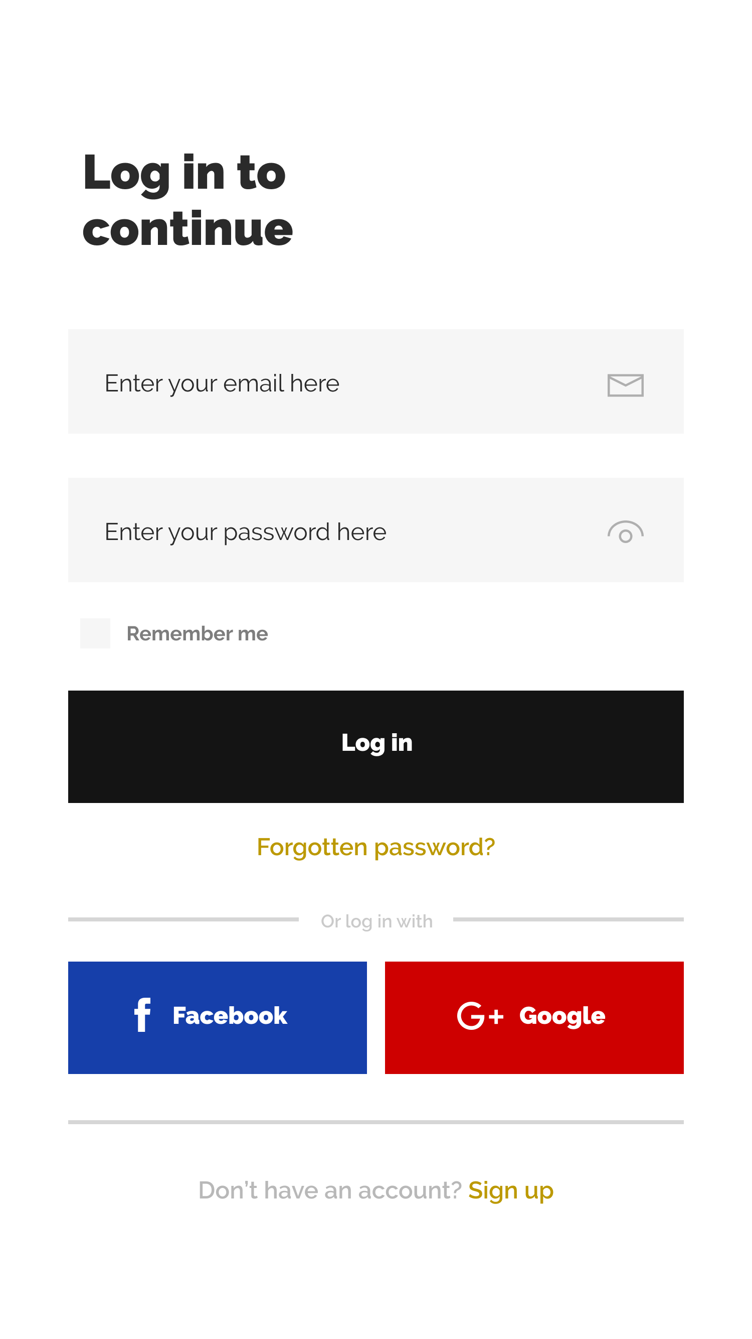
Same journey on phone: search, property detail, bookings, and wallet-forward payment for repeat guests.
Structure before polish
User flow and four-screen wireframes aligned the client on journey and layout before high-fidelity investment.
Outcome
COVID paused development before launch. The designs left a clear resume path: validated flows, a visual system for the extended catalog, and success criteria for when the team ships.
Intended goals (not measured results):
- Shift most bookings to self-serve web and app
- Cut time-to-booking by simplifying the decision path
- Improve first-visit retention through clearer value and proof
- Drive wallet adoption for faster repeat purchases
- Grow app adoption among active customers
Key Learnings
What worked
- Validating four core screens with the client before high fidelity kept scope honest
- Multi-category IA matched how CasaFlo already sold in the real world
- Wallet-forward mobile checkout targeted the repeat-booking pain that calls couldn’t fix
What I’d do differently
- Prototype hybrid flows earlier for categories that still needed human coordination
- Pressure-test payment trust copy with first-time guests before polish
- Define offline/ops fallbacks alongside the self-serve happy path
Core insight
- Self-serve only works if it inherits the trust. The product had to feel as responsive as a great agent—not like a colder catalog.