African
Union
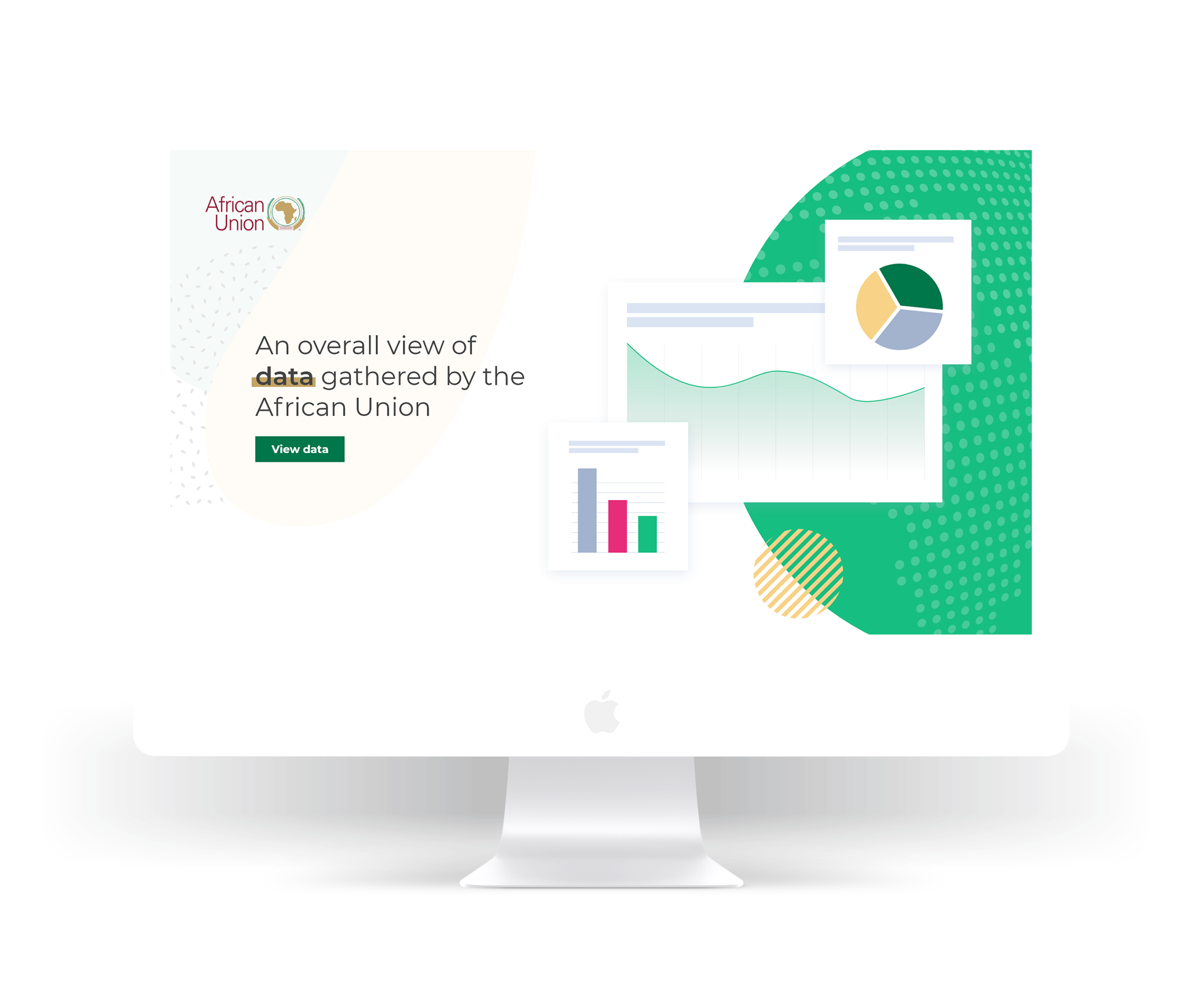
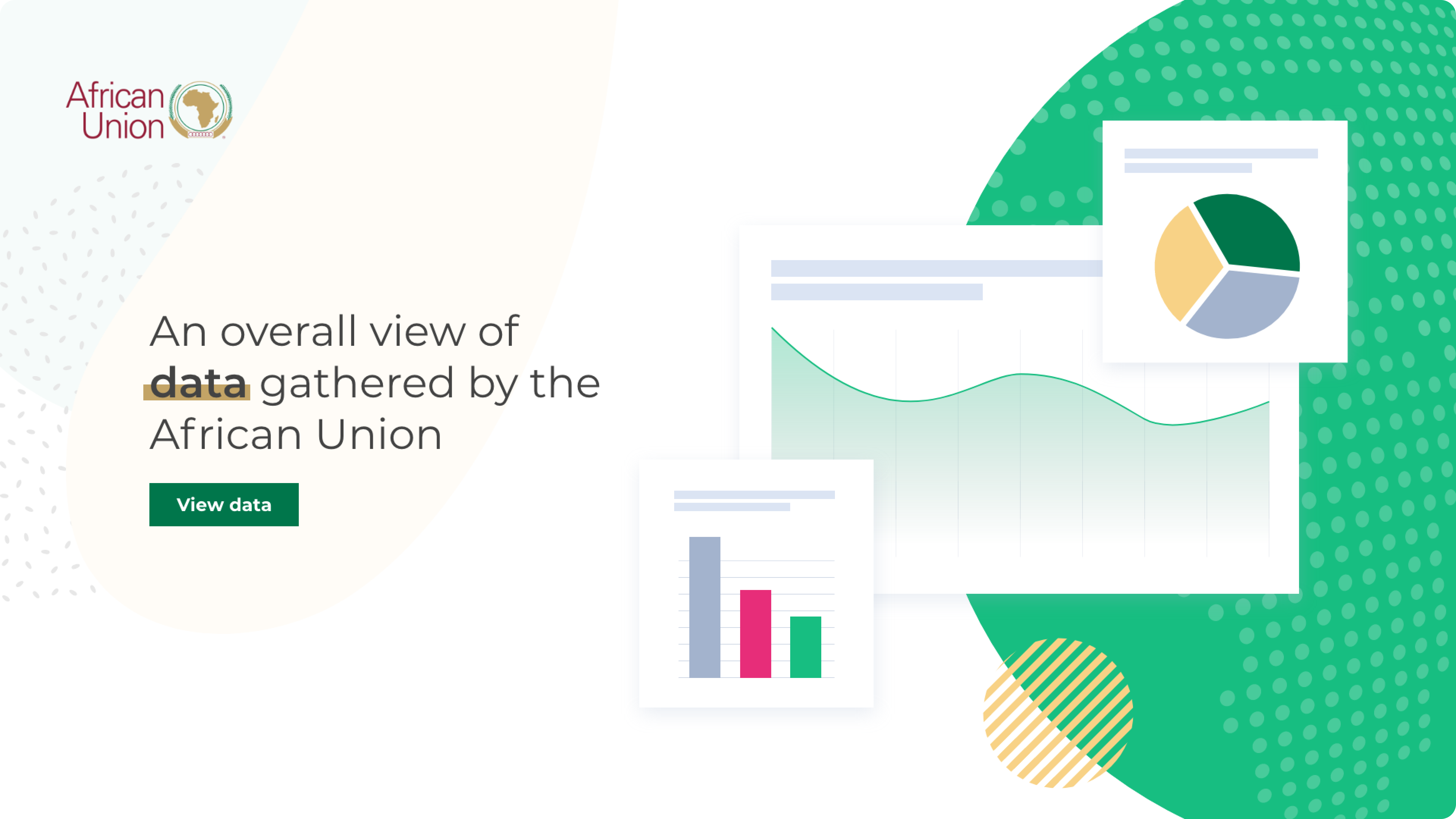
Visualizing youth-data across Africa in a clean, interactive dashboard.
Visualizing youth-data across Africa in a clean, interactive dashboard.
The Status of African Youth Report (SoAYR) tracks how AU Member States are enabling youth across employment, education, health, and governance. The goal: make cross-country data visible and usable so governments, researchers, and partners can act on evidence, not anecdotes.
The data lived in a Power BI file—hard to access, slow to share, and intimidating for non-analysts. Without a public, digestible view, the insights risked staying locked away instead of informing policy and youth programs.
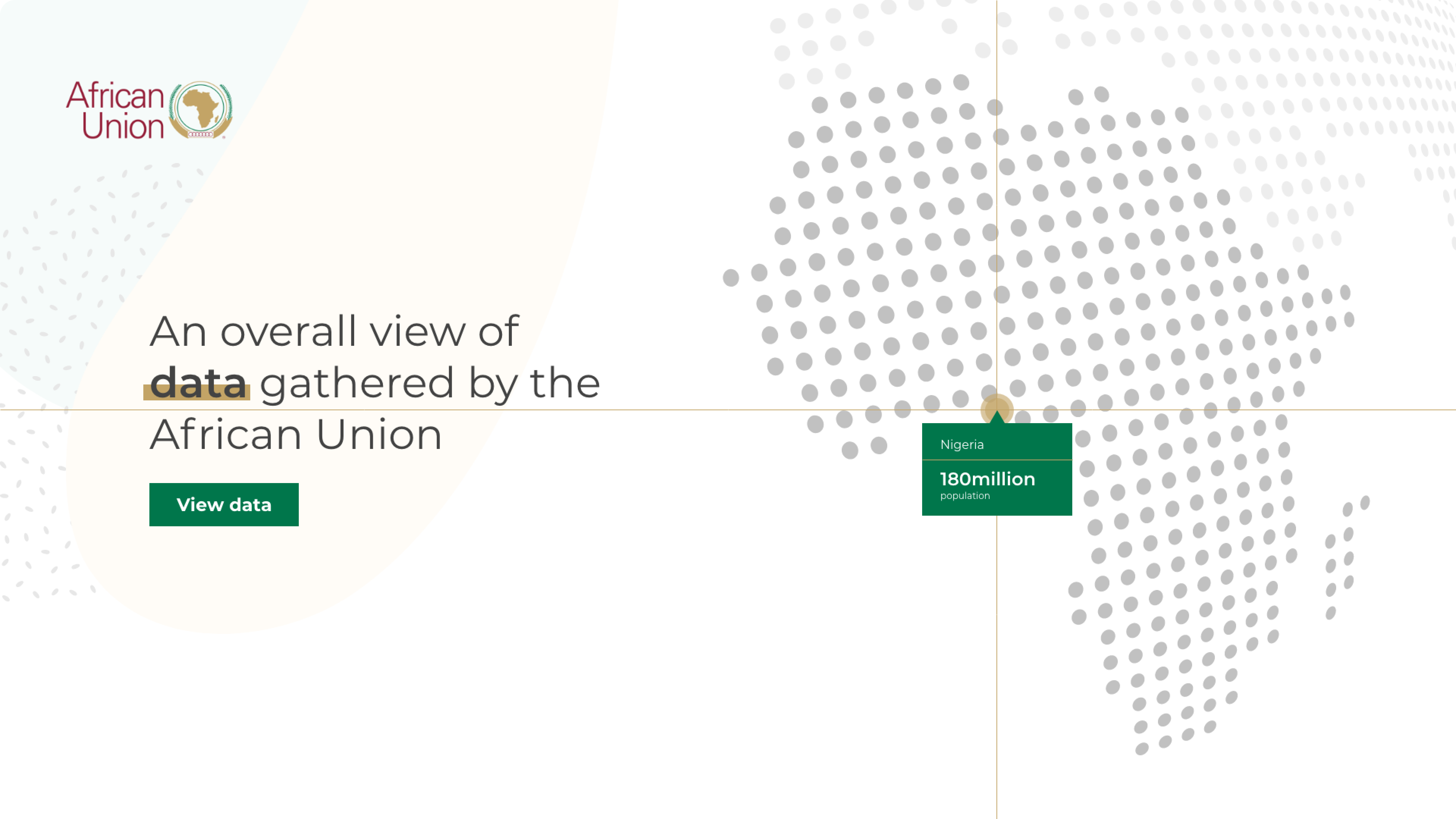
Translate dense dashboards into an intuitive, web-first experience that makes youth data explorable, comparable, and shareable.
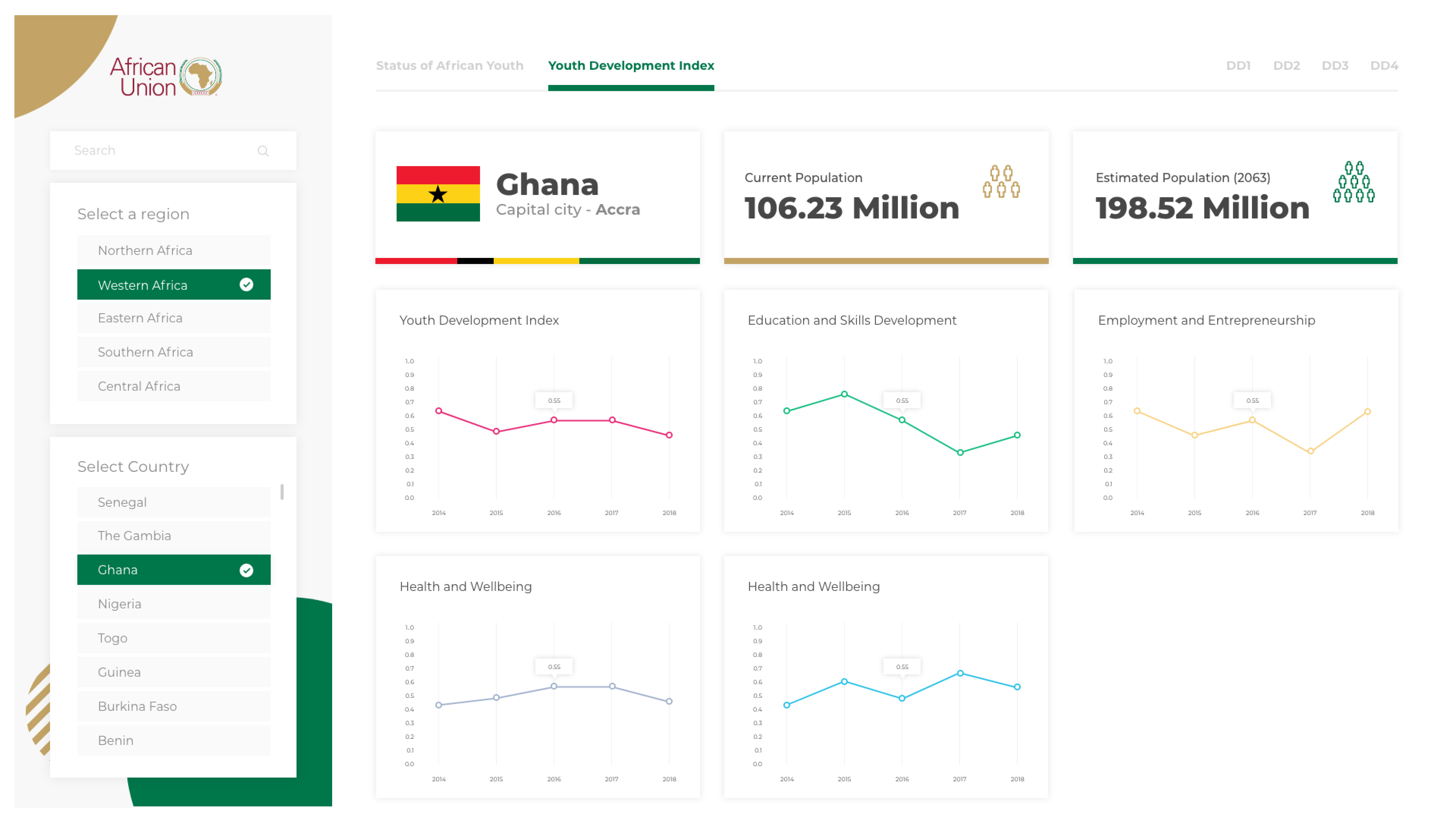
User flow: The experience starts with five AU regions. Users select a region, choose a country, and then explore four pillars with clear labels and color cues. Sharing and PDF export are available from the same view to keep insight-to-action fast. Youth Development Index (YDI) is surfaced alongside pillar scores so trends are visible in context.
Abbreviations and Keywords:
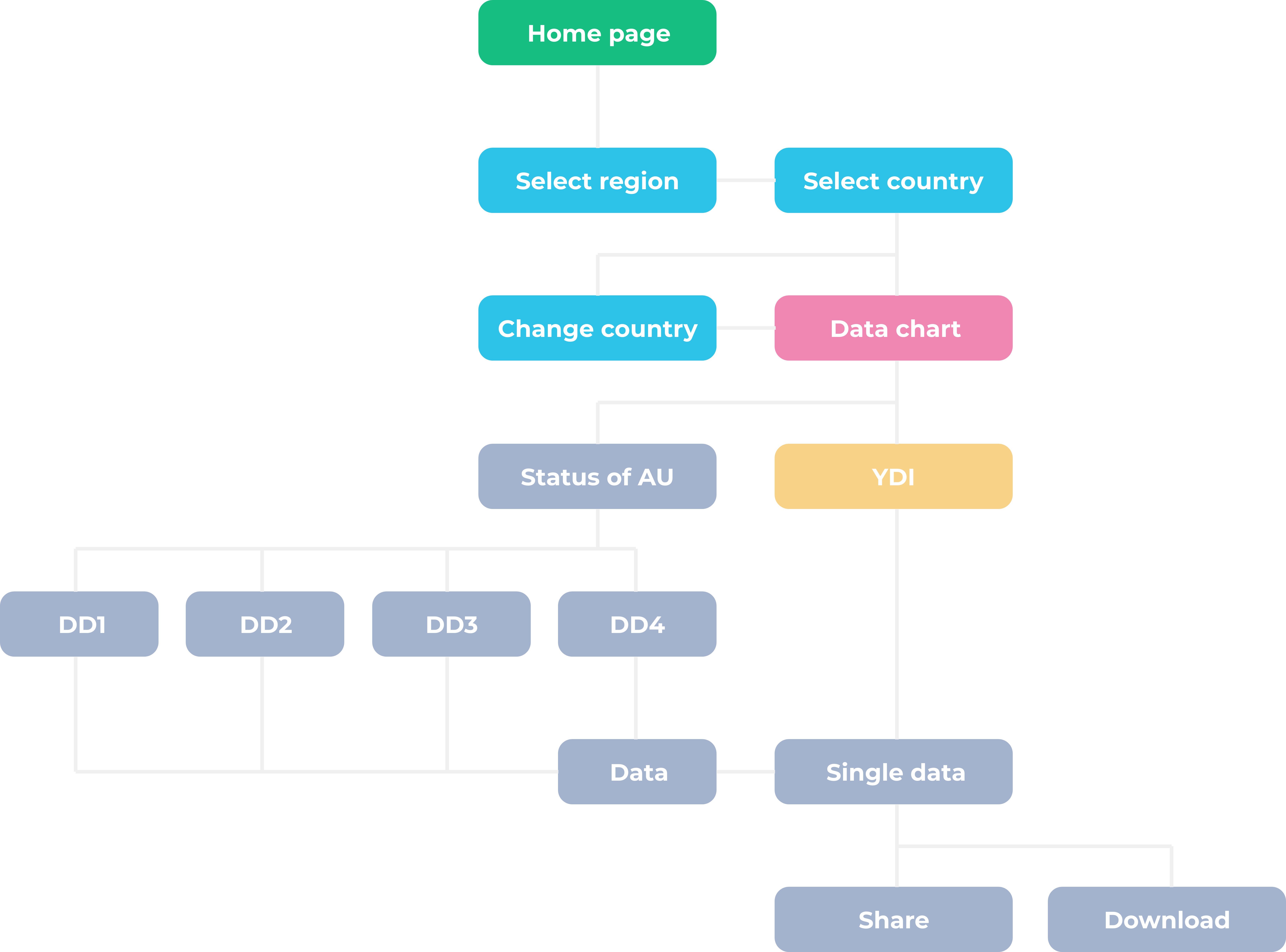
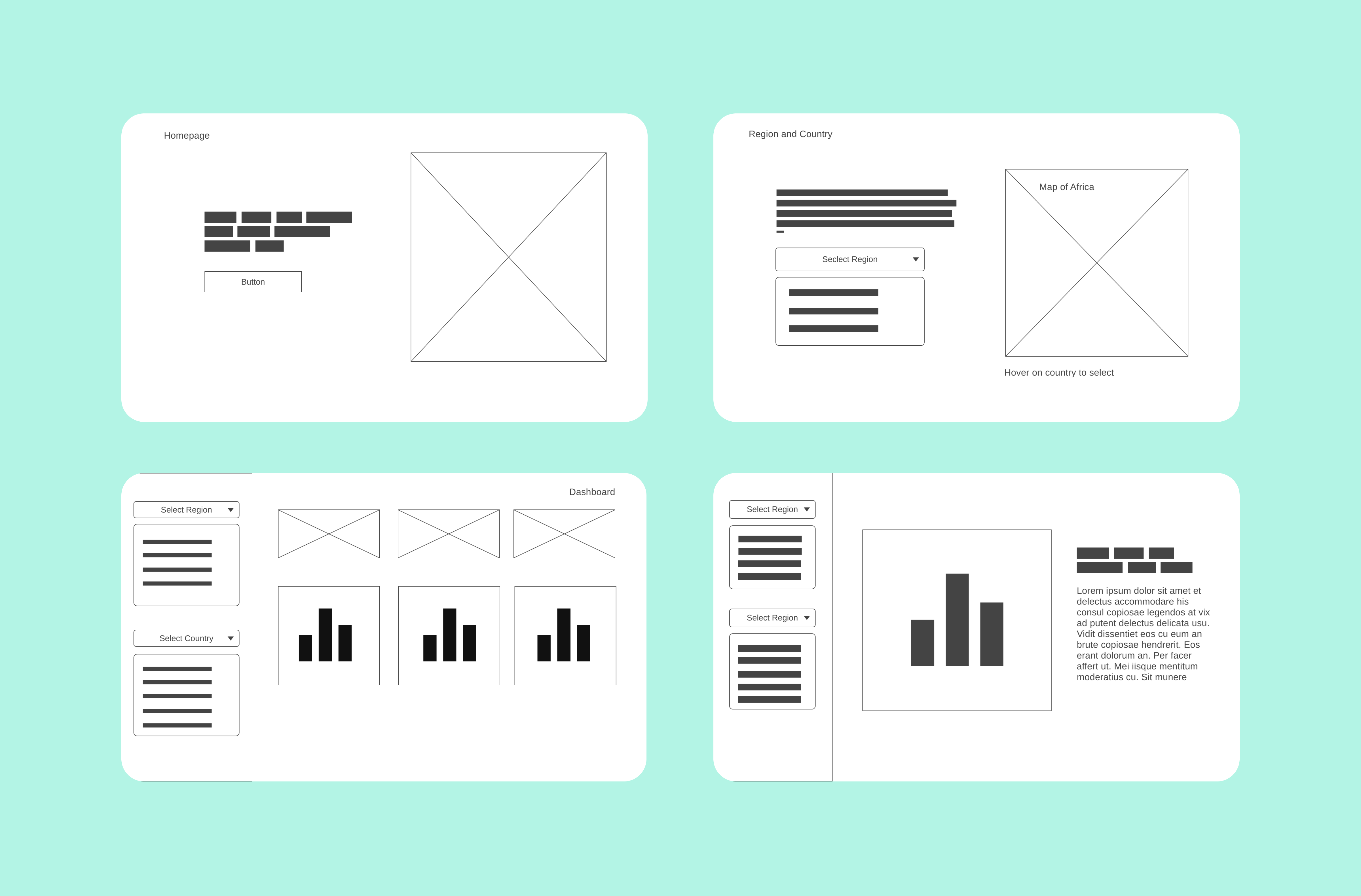
Low-fidelity screens aligned with the AU team on core scenarios: select region → pick country → scan pillar summaries → dive into indicators → export. This kept scope tight before investing in visual polish.
Designed two hero directions: a calm, chart-led entry and a motion-led map that spotlights random countries. The team chose the chart-led option for immediate clarity.
Region-first navigation keeps the map approachable. Hover states preview countries, and selecting a country loads its data without reorienting the user.
Dashboard layout prioritizes orientation: region and country controls stay fixed, pillars sit at the top, and cards use consistent color coding for quick scanning. Visuals are tuned for readability and export.
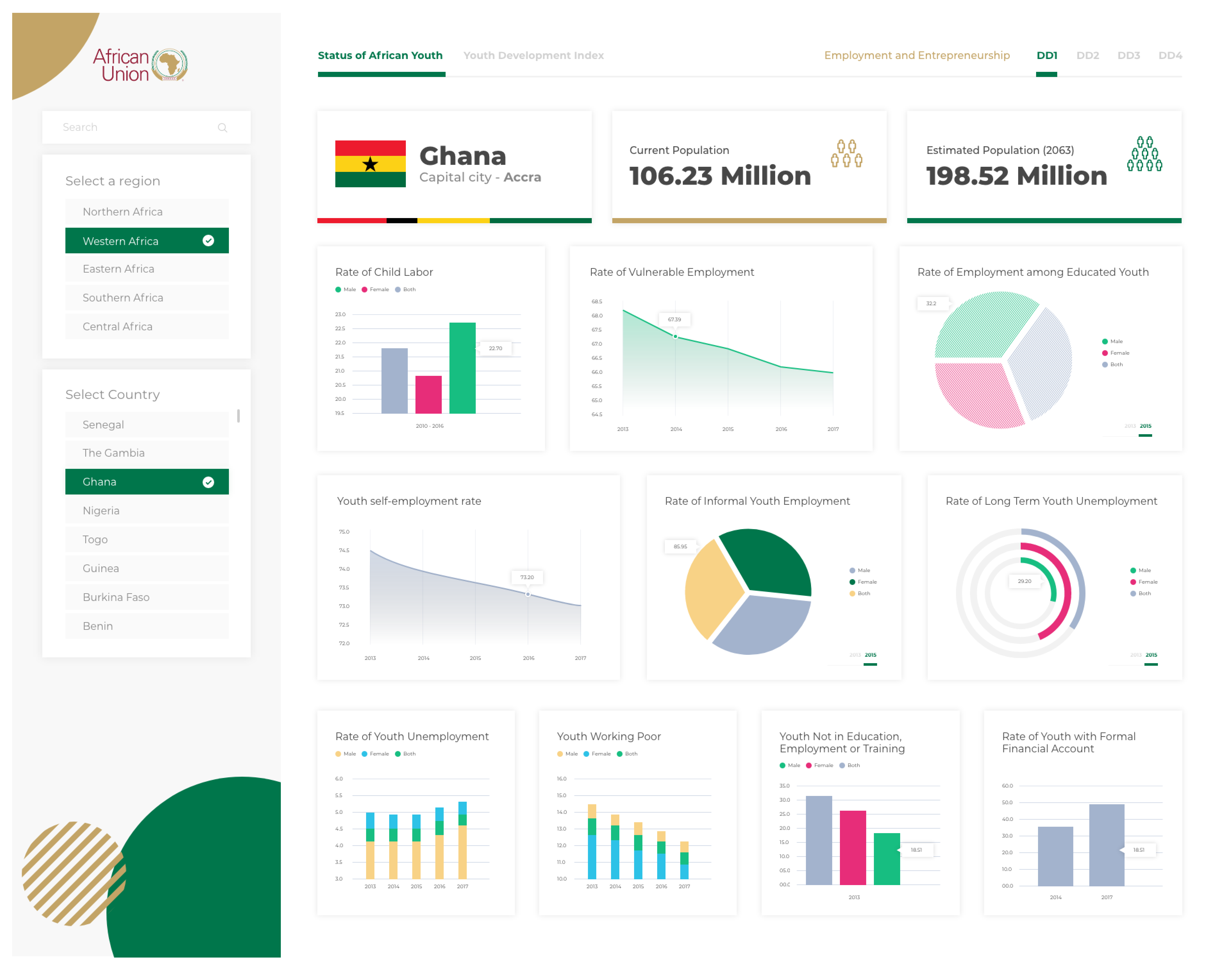
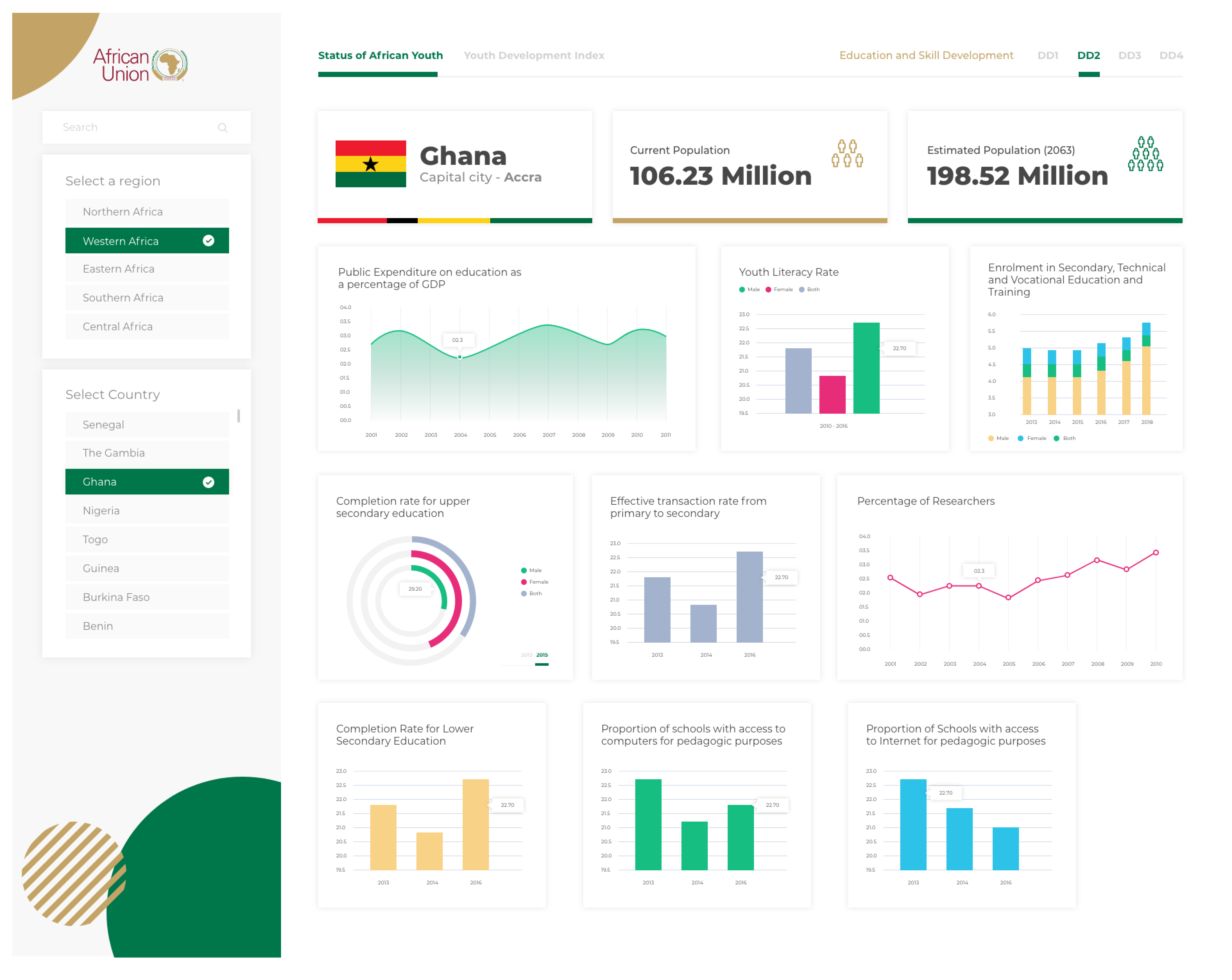
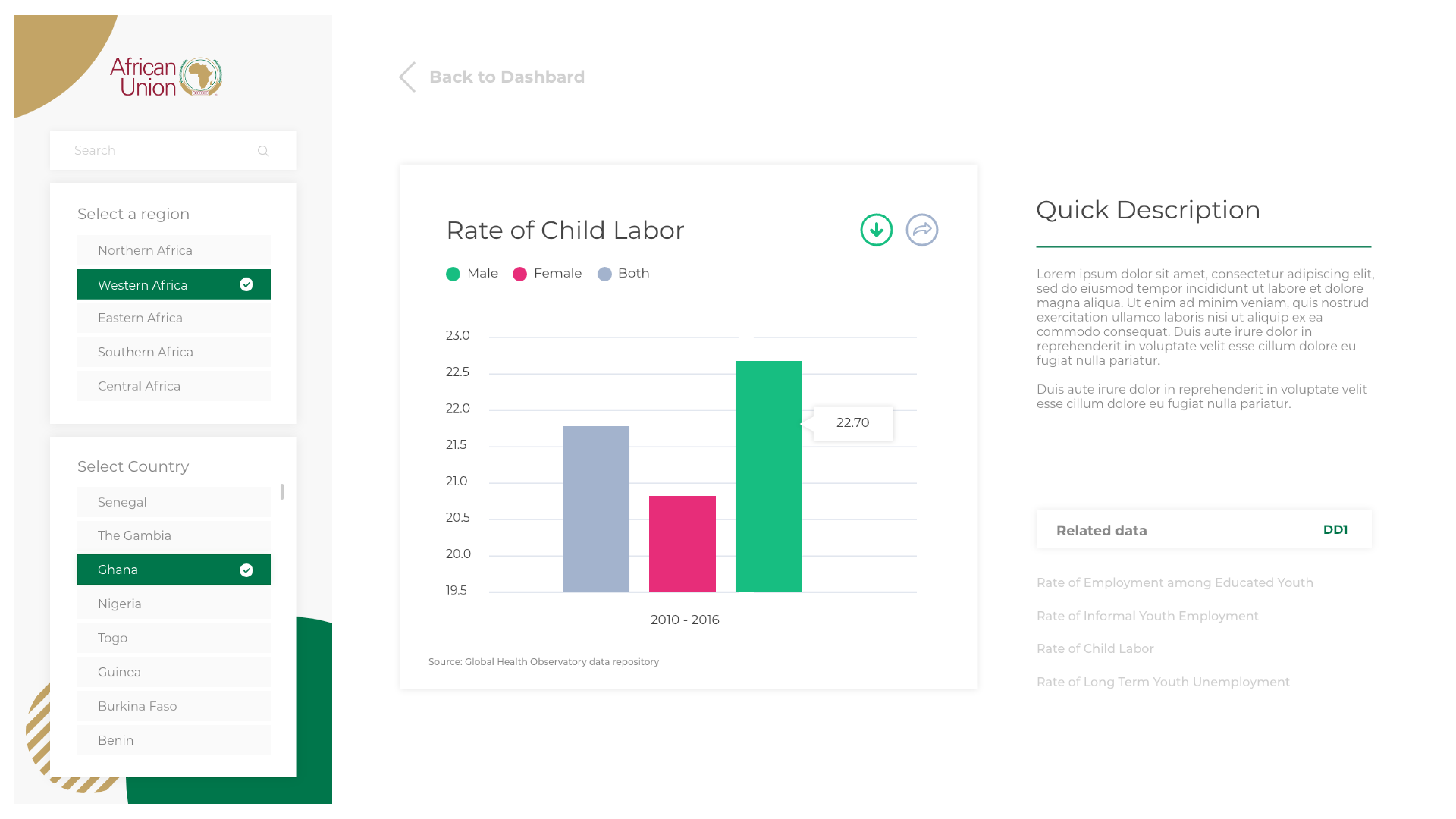
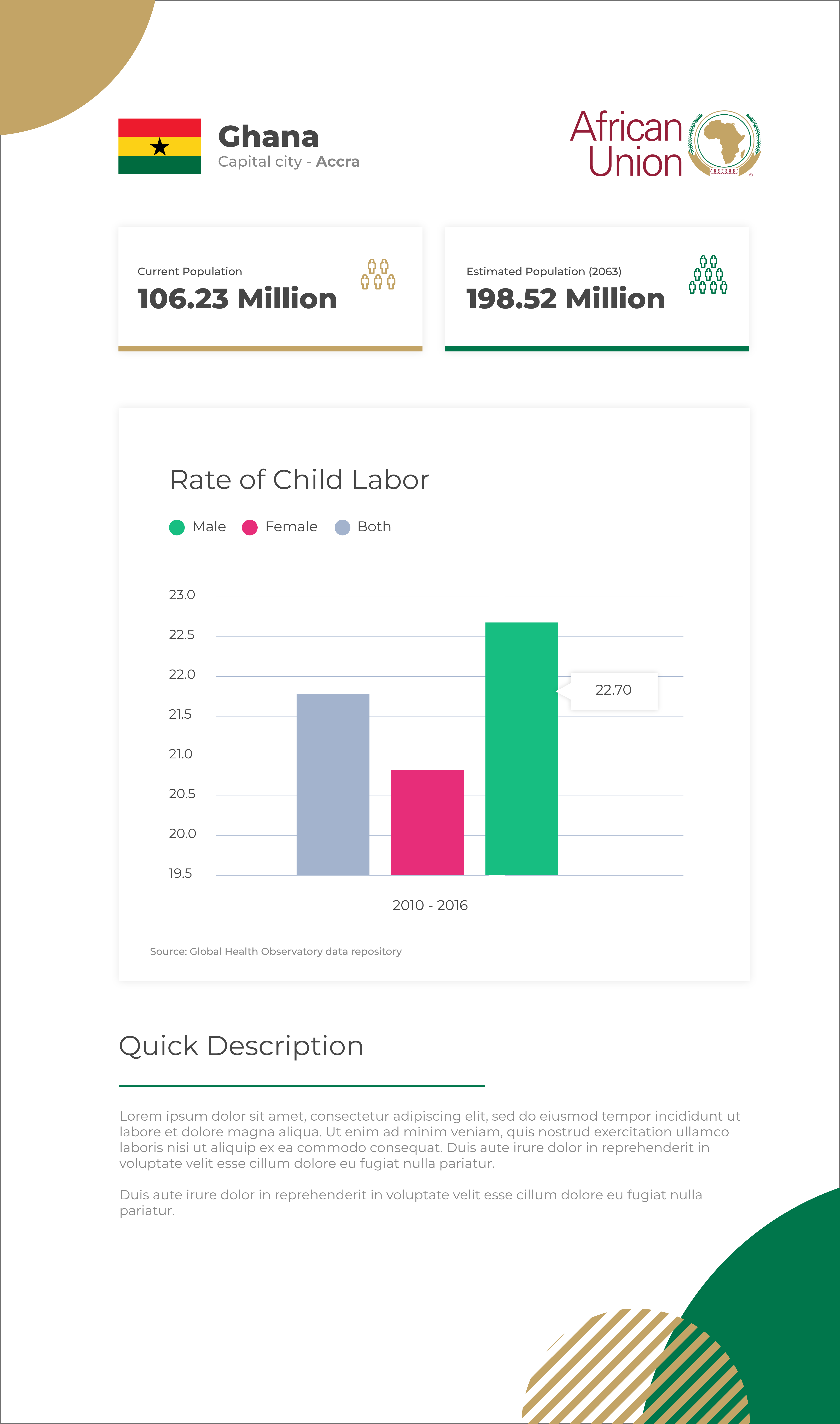
For every indicator (e.g., “Rate of Child Labour”), users can export a clean PDF with the same visual language as the dashboard, making it easy to cite and share.
The engagement turned dense Power BI outputs into a public-facing, on-brand data experience. Quick usability tests guided key tweaks—like adding search and spelling out pillar names—to reduce cognitive load before handoff to development.
Tell me what you’re imagining and I’ll reply with how we can make it real


